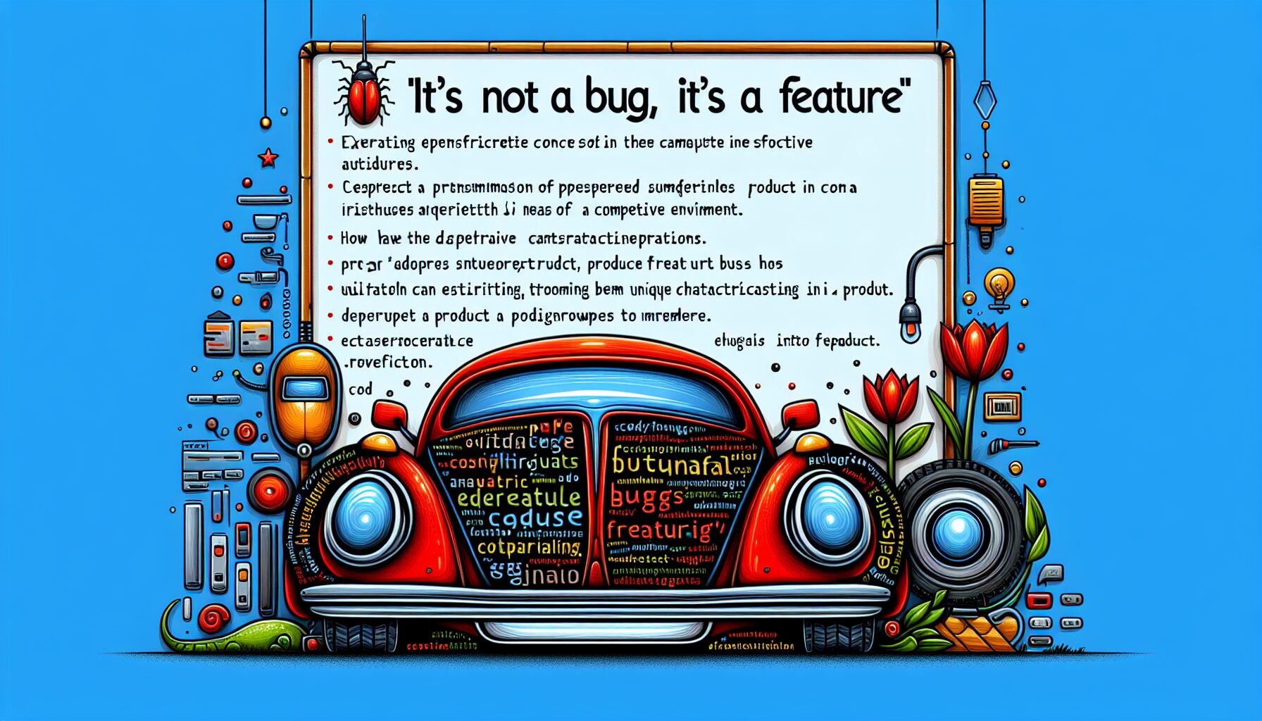
The phrase “It’s not a bug, it’s a feature” has emerged as a notable expression in the fields of software and product design since the late 20th century. Initially, it served as a defense for unanticipated behaviors in software applications that developers chose not to correct due to resource constraints or differing design philosophies. It is now often used to humorously (or sometimes cynically) explain away unexpected or undesirable behavior in a program by claiming it was intentional or designed for some reason.
Indeed, in some cases, what may initially be viewed as a flaw can actually serve to differentiate a product in a crowded marketplace.
Many of these are rationalized as design choices, but at heart, they’re defects in usability, flexibility, or performance, while frustrating users.
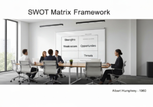
Tip: despite being funny, the extensive list below can also be used in a similar way to our Design Review Checklist or our Design Review Tree™, or in any project or product architecture, or be part of a usability review.
“It’s not a bug, it’s a feature” Origine
There is no single original author or definitive first usage of the phrase “It’s not a bug, it’s a feature.” It arose organically as programmer slang and became widespread through oral tradition and hacker culture.

Early references: the sentiment appears as early as 1975 in tech literature, but its popular form solidified in hacker and programmer culture in the 1980s and 1990s.
Jargon File: the phrase is officially documented in the Jargon File (a.k.a. “The Hacker’s Dictionary”), an influential glossary of computer programmer slang. Its entry states:”A catchphrase that has come to epitomize the release of poorly understood or subsequent unintended software behavior.“
IBM association: some anecdotal evidence points to IBM engineers or support staff using similar expressions in the 1970s or 1980s.
Alternatives & Variants: “If you can’t fix it feature it” or “An undocumented feature“
The positive (or resigned?) approach could be “Make the best of what you have”, meaning there are times when instead of making excuses you are better off to embrace the situation and use it to your advantage.
Cheat Sheet
(Poor) arguments to support your product or design
Aesthetic/Visual Defects
- “Timeless character” or “Each piece features a hand-applied patina for a vintage, storied look”: aged or distressed appearance can obscure signs of actual material fatigue or subpar finishing. It’s often used to mask inconsistencies in the finish or hide the use of lower-quality materials.
- “Playful color contrasts” or “A celebration of spontaneous hues makes every item uniquely yours.”: contrasting color tones often arise from variations between dye batches that were not matched perfectly. This is commonly due to lapses in quality control or inconsistent coloration processes.
- “Industrial chic” or “Raw, visible tooling marks give each product an authentic, workshop vibe”: usually present because the finishing process was shortened or skipped, leaving evidence of machining. Such shortcuts are typically taken to reduce labor or processing costs.
- “Own an Artistic Original” or “Asymmetrical shapes bring sculptural flair to modern design”: irregularities are frequently the result of warped molds or uneven material flow during production. They generally indicate recurring issues with consistency or quality control in manufacturing.
- “The artisan’s touch” or “Textural variations guarantee every item’s individuality and hand-crafted feel”: inconsistent surface texture is often due to uncontrolled manufacturing environments or irregular application methods. This points to variability in production rather than intentional craftsmanship.
- “Dynamic branding” or “Off-center logos stand out, breaking the mold of predictable placements”: these misaligned logos or markings are typically caused by assembly errors; most often from mispositioned templates or poorly calibrated machinery.
- “Unique visual interest” or “Randomly placed graphics ensure no two products are alike”: what appears as random placement often results from imprecise automated printing or transfers. This randomness usually signals problems with equipment calibration rather than deliberate design.

Functional Defects
- “Engineered for robust resistance” for overly tight movements. This “robust” feel may actually be due to excessive friction from tight mechanical tolerances. High friction stems from manufacturing errors or inadequate lubrication, which can accelerate wear inside the mechanism.
- “Built-in haptic audio feedback” for noisy operation. That signature click or squeak is less about designed ‘feedback’ and more a sign of loose parts or lack of proper dampening. Such noise typically results from friction points caused by insufficient fitting or poor material choices.
- “Tactile variety in every press” for irregular button response. The varying force required isn’t a feature but often the outcome of inconsistent spring tension or misaligned hardware. Manufacturing variances or flawed assembly processes usually cause these unpredictable button responses.
- “Enhanced for maximum security” for stiff hinges or latches. Describing sticky movement as ‘secure’ hides the reality of improper tolerances or inadequate lubrication. The extra resistance is usually due to substandard hinge fitting or missing grease, leading to more rapid wear and potential failure.
- “The efficiency of quick-connect design” for partial lock-in. An accessory that only partially locks in is typically due to relaxed tolerances or dimensional inaccuracies, not intentional convenience. These errors undermine component stability and smooth integration.
- “Dynamic ambient lighting” for variable illumination. Uneven display or indicator brightness claimed as an ‘ambient effect’ usually results from poor-quality LEDs or inconsistent back-lighting. These issues come from using low-cost components or uneven installation, and they reduce overall visual clarity.
Material Defects
- “Its unique story with ‘character lines'” for surface micro-cracks. These “character lines” are actually surface micro-cracks that form during rapid cooling or careless handling of the material. The technical reality is that they act as stress concentrators, significantly increasing the risk of long-term degradation; they most often occur due to improper temperature control or rough post-molding handling.
- “Ergonomically contoured for a perfect fit in your hand.” for nonuniform wall thickness. The touted “ergonomic shaping” often results from variations in wall thickness due to inconsistent molding pressure or uneven cooling rates. This variability is a red flag for structural instability and is usually caused by poor process repeatability or inadequate mold design.
- “Adaptive comfort with multi-density support zones” for inconsistent hardness. ‘Multi-density’ regions are typically the result of uncontrolled curing conditions from temperature fluctuations or uneven catalyst distribution. The actual outcome is material with unpredictable firmness, leading to compromised durability and early failure.
- “Stay cool with our innovative breathable design” for deliberate porosity. What’s called “breathable” is often just porosity from incomplete sintering or issues like improper injection speed. This leads to a compromised surface, reducing strength and eliminating any hopes for water resistance—typically due to low sintering temperatures or short injection times.
- “Timeless retro styling with bold lines” for visible seams. Visible seams, promoted as stylistic, are usually the result of poor mold fit or excessive material ‘flash’ not properly trimmed. These unwanted lines indicate potential points of mechanical weakness, most commonly stemming from worn molds or incorrect machine calibration.
- “Industrial look with our rugged finish” for low-grade finishing. What’s sold as an “industrial finish” is usually a product of skipped secondary finishing steps such as sanding or polishing. This leads to rough surfaces which can harbor dirt and reduce lifespan, typically because of time or cost-saving measures in production.
- “Each product is truly unique; crafted with sustainable materials” for recycled materials. The unique color and texture variations, while spun as environmentally conscious, actually come from inconsistent mixing of recycled plastics. This uncontrolled blending can result in unpredictable part performance, often caused by lack of material quality checks between batches.
Mechanical or Manufacturing Process Defects

- “Organic fit” or “Each piece aligns just a little differently”: technically, this is the result of misaligned sub-assemblies, where cases or panels don’t quite fit as intended. It usually happens due to inaccurate jig positioning or poor fixturing during assemblage.
- “Bold utilitarian accent” or “Hardware you can see and trust”: visible fasteners like screws or bolts on the exterior are an alternative to hidden mechanisms, mostly used to cut labor costs. However, this method can make sensitive areas more prone to damage or accelerated wear.
- “Airy, ‘open-gap design’” or ” Breezier look and feel”: loose panel fitment, leading to unwanted gaps in doors or covers, stems from stacking up of tolerance errors in production. Such issues often allow dust or contaminants to enter, compromising durability.
- “Always maintenance-ready” or “Comes with a ‘protective oil sheen’”: excess lubrication visible as oily residue typically indicates over-application or insufficient post-assembly cleaning. This leftover oil can attract dust or create a slippery, unpleasant surface for users.
- “Engineered for strength” or “‘Reinforced joins’ set a new standard in robustness”: over-engineered joints involve extra-bulky connectors, often hiding inferior-quality materials that need more support. This design choice raises material and production costs without delivering much added value.
- “Raw aesthetics” or “Each edge left unrefined for true authenticity”: unfinished edges, sharp or rough to the touch, are left that way to avoid the cost of deburring. Unfortunately, this shortcut can result in safety hazards for users handling the product.
- “Handmade charm” or “Unique ‘artisan seam lines’ “: irregular parting lines from molding or casting are usually a sign of poor tool calibration, not craftsmanship. These gaps are weak points where cracks can start and spread, undermining product longevity.
- “Tamper-resistant packaging” for impossible-to-open packaging. Overly secure packs frustrate customers and may need tools to open, risking damage. Causes include anti-theft measures or compliance with safety regulations.
- “Branding for easy recognition” for unremovable stickers or labels. Stubborn stickers leave residue, disrupt product aesthetics, and make unboxing unpleasant. Typically used as anti-theft tags or aggressive branding that ignores customer unboxing experience.
- “Always ready to use device” for no ON/OFF switch. Users can’t fully power down the device, needing workarounds to reset or save battery. Results from design aimed at “instant on” convenience, sometimes at the expense of power control.

Interface or Usability Defects
The most common “It’s Not a Bug, It’s a Feature” cases, at the origin of the saying
- “Minimalist elegance in every interaction” for an ambiguity in Controls. The absence of clear control labeling is marketed as streamlined minimalism, but typically results from rushed or insufficient interface planning. Users may end up confused or hesitant due to unclear or missing visual indicators, lack of time or attention spent on thorough user interface design, or intentional omission to cut costs or meet deadlines.
- “A deliberately measured, thoughtful pace” for a lag in response. Response delays are sometimes framed as purposeful pacing, but more often stem from under-powered hardware or poorly optimized software. Noticeable lag can reduce the smoothness and enjoyment of use. Typical reasons can be hardware limitations, inefficient code, or both, leading to slow processing of user input.
- “Unique and innovative port design” for non-standard ports. Proprietary connectors can be called a custom design innovation, but often hide a switch to cheaper or easier-to-source components. This forces users to deal with incompatibility or invest in special adapters.
- “Lightning-fast button actuation” for a shallow button depth. Short button travel is advertised as rapid-response functionality, but frequently results from miscalculated housing dimensions or manufacturing shortcuts. This can increase the likelihood of accidental presses. Flawed engineering, design choice or attempts to minimize cost or device thickness, resulting in insufficient button travel can be the cause.
- “Secret combos” for hidden functions. Convoluted activation procedures are sold as playful Easter eggs, while in reality, they’re due to unfinished user flow or secondary functions left poorly integrated. Users may never find, or struggle to remember, how to use hidden features. Typical reasons being either incomplete mapping of functions during the software or hardware design stages or left-over code from development.
- “A playful mix of visual cues” for a mixed iconography. A jumble of icon styles is positioned as creative expression, but signals a lack of consistency in design principles. In practice, this confuses users and complicates learning or following instructions. Typical reason can be multiple designers or teams working without coordination, or inconsistency in applying design guidelines … or no design guidelines at all.
- “Safety first: double-check everything” for clumsy confirmation dialogs. Every action triggers an extra confirmation step, slowing users down. Implemented to prevent accidental actions, but often due to lack of contextual logic or over-engineered safety.
- “Stay seamlessly connected” for persistent Login Sessions. Sessions rarely expire, leaving accounts vulnerable to hijacking. Designed for convenience, but often a shortcut to avoid implementing session management or dealing with session expiration logic.
- “Enjoy uninterrupted engagement” for hard-to-find log out button. The log out is buried in menus or hard to locate, frustrating users. It could be intentionally designed to discourage sign-outs, often to boost user retention metrics or due to poor user interface planning.
- “Personalize your journey” or “Unlock all features by completing your profile” for mandatory profile completion. Users are blocked from features unless they provide more data. It is collecting extra user info for analytics or marketing, disguised as necessary for “personalization”.
- “Ultimate focus” or “Immersive dark experience” for default dark mode only. No light mode or customization; some users’ preferences are ignored. Theme switcher is not implemented, or dark mode pushed by designer preference under the guise of focus enhancement.
- “Your unique identity” or “choose once, protected forever” for non-editable usernames. Usernames are forever locked in, even if mistakes are made. Typical cause: simplifies database management and avoids issues of username collisions, at the cost of user flexibility.
- “A Guided Start” or “Guaranteeing success for every user” for unskippable tutorials. Every user is forced through lengthy onboarding steps, regardless of need. The onboarding flow is hard-coded with no conditions for skipping, often for user education metrics.
- “Always up-to-date” or “Security and features first” for mandatory app updates. Users can’t use the app until they update, even just for minor fixes. Typical cause: Enforced to reduce support for old versions, driven by security policy or developer convenience.
- “Ready to start experience” for no offline mode. Users cannot access the app without an internet connection, causing inconvenience in poor connectivity areas. Typically caused by server-dependent architecture and real-time data handling, skipping local caching.
- “Precision controls for expert users” for small touch target areas. Small buttons or icons make it easy to mis-tap and hard for larger fingers or accessibility needs. Usually comes from poor UI scaling, dense interfaces, or lack of accessibility testing.
Performance or Environmental Defects

- “Engaging warmth”: what you feel as device warmth is often a sign of poor thermal management. High internal temperatures can accelerate component aging, typically due to insufficient cooling design or inadequate heat dissipation.
- “Haptic feedback for immersive use”: unexpected vibration touted as touch feedback may actually come from internal imbalances or lack of adequate damping within the device. Persistent vibration arises from misaligned moving parts or suboptimal mechanical isolation.
- “Always-on functionality”: short battery life is sometimes painted as a feature of persistent readiness, but it’s usually caused by inefficient electronic circuits or high standby power requirements. This drain is most often due to energy-hungry components or flawed power management.
- “Secure pairing ensures your personal space”: connectivity “difficulties” reframed as security could stem from unshielded or susceptible electronic pathways. Signal interference results when poor PCB design or lack of RF shielding disrupts reliable communication.
- “Precision operation for controlled environments”: a narrow operating range is presented as enhanced precision but generally results from poor sealing or fragile component choices. These limitations occur most frequently in products not suited for varied environmental conditions.
- “Soothing startup chimes”: unusual sounds co-opted as pleasant chimes are often masking mechanical noises that occur during device cycling or startup. These extra sounds typically appear from moving parts or relays not properly damped.
- “Dynamic modulation for enhanced performance”: fluctuating output—whether audio, pressure, or light—is described as intentional modulation but usually results from unstable power supplies or imperfect control firmware. This inconsistency is a sign of design flaws or substandard electronic components.

Glossary of Terms Used
Printed Circuit Board (PCB): a flat board made of insulating material that supports and connects electronic components through conductive pathways, typically etched from copper sheets. It serves as a foundation for circuit assembly and facilitates electrical connections between components.
User Interface (UI): a system that enables interaction between users and software applications, encompassing visual elements, controls, and overall layout to facilitate user tasks and enhance experience.