In the 1990s, Nielsen and Molich created 10 user interface guidelines. These guidelines are key in how we design graphic user interfaces today. They help us make interfaces that are easy to use and understand, improving how users interact with digital platforms. A good user interface combines beauty with practicality, making it simple for people to use software or apps.
Key Takeaways
- Nielsen and Molich’s guidelines are still relevant in modern graphic user interface design, guiding designers towards more intuitive interfaces.
- Incorporating these established principles can enhance usability, utility, and desirability in software applications.
- User interface design should focus on minimizing user effort and maximizing satisfaction.
- Consistency and familiarity in layout and terminology help users acclimate quickly to new interfaces.
- Effective feedback mechanisms and error prevention are crucial in creating a smooth user experience.
Introduction to GUI Design
In the tech world, GUI design matters a lot for creating useful and good-looking apps. Knowing the basic principles helps designers make interfaces that improve user experiences. This support also builds brand loyalty.
What is GUI Design?
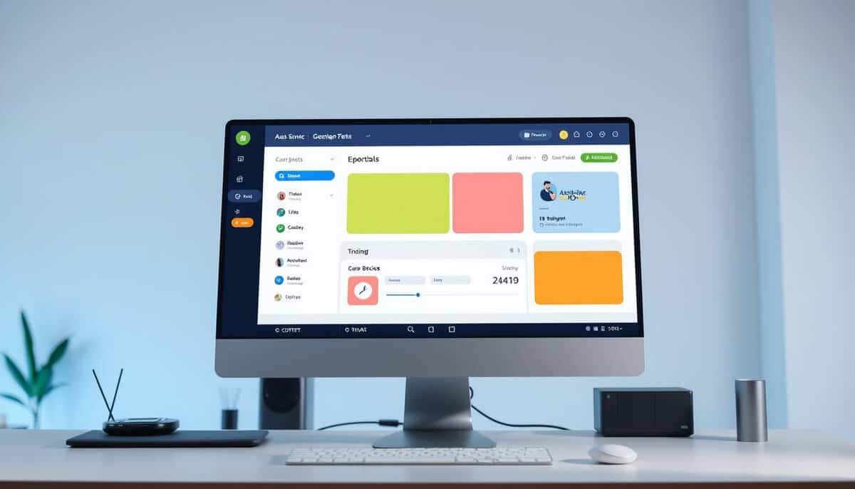
GUI design means working on the visual parts of a user interface. Designers create elements like menus and buttons that are straightforward and simple to use. The Apple Macintosh, which brought icons and mouse clicks, set the standard high.
The Importance of Intuitive Interfaces
Intuitive interfaces make it easier for users to do tasks. They also play a big role in a product’s and company’s success. Take the Xerox Star: it was first with a GUI but failed in the market. But Steve Jobs took inspiration from it for the Apple Lisa and Macintosh, which were hits. Note how the Windows’95 GUI, despite its complaints, stressed the need for smart design.
It’s also key to understand concepts like affordance. Affordance means something looks usable, while false affordance leads users astray. Nielsen and Molich’s guidelines stress lessening mental strain and keeping things consistent. This makes interfaces easy to get used to.
Following these design rules helps make applications focused on the user. They not only work better but also make users happier and more loyal. The goal, no matter the system, is smooth interaction and a great experience for the user.
Key Principles of GUI Design
Creating user-friendly digital products starts with good Graphical User Interface (GUI) design. This involves providing intuitive and engaging visual interfaces. It focuses on making the user’s experience better.
Simplicity
Simplicity in GUI design means keeping everything straightforward. This makes for smooth user interactions. Interfaces are easy to use when they’re not cluttered. Designers aim for this simplicity. It helps users explore without feeling overwhelmed.
Keeping design simple boosts user satisfaction. This is true for both websites and apps. Simplicity ensures users enjoy their time on the digital platform.
Consistency
Consistency matters a lot in GUI design. It’s about keeping things uniform. This includes color schemes, typography, and icons. When these elements are consistent, users feel more at ease. This helps them navigate better.
Good design maintains this consistency everywhere. This should be the case in both web and app design. It’s how you keep users happy and less frustrated.
Feedback
Feedback is a key part of GUI design. It lets users know the results of their actions. This could be through visuals, sounds, or vibrations. Good feedback helps users feel in control.
It builds trust by creating intuitive experiences. Users need this to navigate confidently.
Hierarchy
Hierarchy guides users to what’s important. It uses size, color, and placement for emphasis. This makes it easier for users to understand and act.
Having a strong visual hierarchy is essential. It allows users to quickly get information and decide.
User-Centered Design Approach
The user-centered design approach focuses on users’ needs and expectations. It puts them at the center of the design process. Through research, user personas, and user flows, products fit their intended users well.

User Research
Comprehensive user research kicks off effective user-centered design. Teams collect data through surveys, interviews, and social media. These methods uncover user experiences and perceptions. Direct engagement offers deep insights into users’ behaviors and needs. It’s crucial for designs that meet real-world needs.
User Personas
User personas are key in user-centered design. They’re fictional but based on real user data. Personas keep design focused on important user groups. They incorporate details like age and goals to tailor designs. This ensures the design is usable and meets various user needs.
User Flows
Mapping user flows outlines users’ paths through a design. It visualizes the journey, aiming for smooth and intuitive interactions.
By predicting user paths, designers can remove hurdles.
This leads to a better user journey. Detailed user flows highlight areas to boost engagement. They make interactive designs more satisfying and efficient.
A user-centered design approach improves GUI usability, satisfaction, and engagement. By prioritizing real user needs and involving them, products are both functional and impactful.
Visual Hierarchy in GUI Design
Visual hierarchy directs users’ focus to key areas by organizing elements wisely. By using size, color, and placement, it improves GUI ergonomics. Since our eyes spot visuals first, a well-structured design is critical for user interfaces.
- Size: Bigger elements grab more notice, showing what’s important.
- Color: Vivid colors pop out and show the brand’s heart, drawing eyes.
- Alignment: Lined-up items create a neat visual flow, guiding the viewer.
- Repetition: Repeating designs makes things familiar and points to linked info.
- Proximity: Items close to each other seem related, making content clear.
- Whitespace: Space around stuff makes it easier to read and highlights areas.
- Texture & Style: Textures draw the eye to key spots and evoke feelings, adding layers to the UI.
Here are common layout patterns:
- Z Pattern: Great for sites with little text, eyes move from top-left to bottom-right.
- F Pattern: Works well for sites with lots of content, eyes sweep left to right, then down on the left side.
Getting these concepts right helps in making visual design work better. This, in return, boosts GUI ergonomics. In the end, it leads to interfaces that are easy and pleasant to use.
| Factor | Impact on Visual Hierarchy |
|---|---|
| Size | Bigger elements stand out |
| Color | Bright colors catch the eye, show brand vibe |
| Alignment | Makes a clean visual order |
| Repetition | Brings comfort, signals related things |
| Proximity | Tells which elements are together |
| Whitespace | Makes content readable, highlights parts |
| Texture & Style | Emphasizes key areas, adds depth |
Effective Use of Whitespace
In GUI design, using whitespace wisely can totally change how users interact. This simple design method keeps the user interface clean. It makes the user experience more fun and efficient.

Creating Focus
Whitespace, known as negative...
You have read 30% of the article. The rest is for our community. Already a member? Log in
(and also to protect our original content from scraping bots)
Innovation.world community
Login or Register (100% free)
View the rest of this article and all members-only content and tools.
Only real engineers, manufacturers, designers, marketers professionals.
No bot, no hater, no spammer.
Related Readings & Methods
- User Experience (UX) Design: Focuses on creating intuitive and seamless interactions within a GUI, ensuring user satisfaction and ease of use.
- User Interface (UI) Design: Involves the aesthetic design elements of a GUI, such as color schemes, typography, and layout.
- Interaction Design: Emphasizes the design of interactive elements and feedback mechanisms within a GUI to enhance user engagement.
- Information Architecture: Organizes and structures information within a GUI to facilitate easy navigation and access to content.
- Accessibility Design: Ensures that GUIs are usable by individuals with disabilities, incorporating features like screen readers and keyboard navigation.
- Responsive Design: Adapts GUIs to different devices and screen sizes, ensuring a consistent user experience across platforms.
- Human-Computer Interaction (HCI): Studies how people interact with computers and designs GUIs that improve the user experience based on these interactions.
- Usability Testing: Involves evaluating a GUI with real users to identify issues and areas for improvement, ensuring the interface is user-friendly.
FAQ
What is GUI Design?
GUI Design focuses on creating interactive visual elements. Its goal is to make these elements both easy to use and good-looking. This enhances the user’s experience.
What are the fundamental principles of GUI design?
Key principles include keeping things simple and consistent. Providing clear feedback and having a clear layout are also important. These help guide users to what’s important.
What is a user-centered design approach?
This approach involves getting to know the users well. It means creating personas to represent them and designing flows that meet their needs. It ensures the GUI works well for the users.
How does visual hierarchy improve GUI design?
Visual hierarchy uses size, color, and placement to show what’s most important. It makes navigating and using the interface easier. This improves the user experience.
How can whitespace be effectively used in GUI design?
Whitespace makes the interface clean and focused. It avoids clutter, making things more readable. This helps users concentrate on their tasks.
Why is consistency important in GUI design?
Consistency makes interfaces predictable and easier to use. It helps build trust with users. This leads to a better and smoother experience.
What are feedback mechanisms in GUI design?
Feedback mechanisms include visual or auditory cues. They show users their actions have been noted. This helps guide them on how to use the interface correctly.
Why is testing important in GUI design?
Testing reveals how users interact with the interface. It allows for improvements based on user feedback. This ensures the GUI meets users’ needs.
How can designers balance aesthetics with functionality in GUI?
Designers aim to create GUIs that look good and work well. A beautiful interface draws users in, but function keeps it easy to use.
What role do microinteractions play in GUI design?
Microinteractions, like animations, make interacting fun and informative. They offer feedback in a subtle way. This helps users complete their tasks more easily.
What are common mistakes to avoid in GUI design?
Overwhelming users with information is a mistake. So is being inconsistent. These can confuse users and harm the experience.
External Links on Ergonomics ans User Interfaces
International Standards
(hover the link to see our description of the content)
Glossary of Terms Used
Asynchronous Transfer Mode (ATM): a high-speed networking technology that uses fixed-size cells for data transmission, enabling efficient and flexible communication across various media types. It supports multiple service types, including voice, video, and data, facilitating Quality of Service (QoS) management.
Graphical User Interface (GUI): a visual interface that allows users to interact with electronic devices through graphical elements such as windows, icons, buttons, and menus, enabling intuitive navigation and control without the need for text-based commands.
Point of Sale (POS): a system that facilitates transactions between a customer and a retailer, typically involving hardware and software to process payments, manage inventory, and generate sales reports. It often includes components like cash registers, card readers, and receipt printers.
User experience (UX): the overall satisfaction and perception of a user when interacting with a product, system, or service, encompassing usability, accessibility, design, and emotional response throughout the entire interaction process.
User Interface (UI): a system that enables interaction between users and software applications, encompassing visual elements, controls, and overall layout to facilitate user tasks and enhance experience.


Arent intuitive interfaces subjective? Whats intuitive for one user might not be for another. Your thoughts?
Absolutely agree! Intuitiveness cant be universal. Whats easy for one could be rocket science for another.
I agree, intuitive interfaces are crucial for user experience, but isnt functionality equally important in GUI design?
Comments are closed.