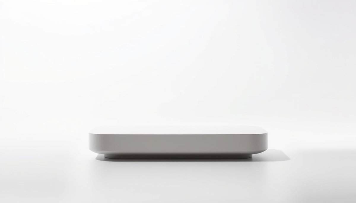
The design principle of “Less Is More” in product design advocates for simplicity and functionality, often leading to enhanced user experience and reduced production costs. By minimizing unnecessary features and focusing on core functionalities, designers create products that are easier to use and maintain. Streamlined designs tend to improve aesthetic appeal and can reduce the likelihood of manufacturing defects, as fewer components result in simpler assembly processes. This approach often aligns with sustainable practices, as it can lead to reduced material waste and energy consumption during production.
Key Takeaways

- Less is more in product design emphasizes simplicity over complexity.
- Minimalist design enhances user experience and satisfaction.
- Clear, uncluttered interfaces improve usability.
- Successful products often prioritize essential features, not excess.
- Simplicity often leads to greater brand recognition.
See the lithography on the right, from Pablo Picasso’s sketch of one of his famous bulls (from Les 11 états successifs de la lithographie Le Taureau, 1945). While most of us would have been more than proud of the first version, it took him 11 versions to get to the simplest version, where any line counts & makes his bull unforgettable. Design Simple was part of the goal and his genius here.
In just a few lines, the bull is recognizable and has all its visual identities (strong shoulders, tail, brave horns, male attributes) in order to pass a strong message while less-important details have disappeared completely.
“Picasso ended where we all would have started” F. Mourlot

This Picasso example is taken, from an excellent article taken from the book of the famous Fernand Mourlot lithograph printer “Gravés dans ma mémoire”, Ed. Robert Laffont (1979).
The same concept of simplicity is highlighted on the left by Leonardo da Vinci in his iconic Vitruvian Man, five centuries ago.
Less Is More
The “Less Is More” design philosophy favors a minimalistic approach in making products. It believes that too much complexity confuses users. This leads to a less enjoyable experience. Designers aim for simplicity, trying to keep ideas pure while keeping them useful.
Several design movements described below support this simple approach. They show how simplicity makes things easier to use as a minimalistic approach helps create a clear, engaging experience by removing what’s not needed.
Understanding Minimalist Design: minimalism in design is about keeping it simple and cutting out the excess. It’s about making sure every part of a design has a purpose. This makes the user’s experience better and keeps things looking good.
Key Principles of Minimalist Design
Minimalism isn’t just about looks, but clarity and functionality and concentrate on what’s really important. Its main points include:
- Using clean lines for an organized look.
- Choosing a few colors to create harmony. In product design, frequently 1 color, maximal 2 colors (and 3 starts to be risky).
- Making user interactions simple.
- Ensuring every part of the design has a clear function.
- Using space to improve the layout.
These ideas show how minimalist design can change technology and architecture. How many colors in the living room picture below?

Importance of Simplicity in Design
Simplicity in design makes everything clear, improving how people use products. Designers work hard to keep things simple. They remove what’s not needed so everyone can focus on what matters.
“Perfection is achieved, not when there is nothing more to add, but when there is nothing left to take away“, Antoine de Saint-Exupéry
- Creating clarity and focus for users: when designs are clear, people quickly get what a product does. Simple interfaces turn tough tasks into easy ones. This makes everyone’s life simpler. Intuitive designs help users move smoothly from one task to the next and cuts down on frustration by making everything faster.
- Usability and safety: simple designs are great for usability and improve how we experience products. By keeping things simple, products don’t overload our brains. This is something top brands know well.
- Enhancing User Experience (UX) through clean and intuitive design: prioritizing simplicity in design enhances user experience. Designers aim for interfaces that users can easily navigate, easy to use in order to appeal to a wider audience. A product’s success often hinges on efficiently solving users’ problems.
| Design Element | Impact on User Experience |
|---|---|
| Simplicity | Reduces cognitive load, making it easier for users to understand and interact. |
| Navigation | Guides users smoothly through the product, enhancing overall satisfaction. |
| Feedback | Provides users with necessary information about their actions, confirming successful interactions. |
| Visual Hierarchy | Directs attention to important elements, improving usability and engagement. |

Design as in the Toki Pona language
Toki Pona (literally good language, language of good) is a full language invented in 2001 by Sonja Lang, aiming for simplicity and good. It is a minimalist constructed language created to express ideas using a small set of words, only about 120 in total. This simplicity encourages clear and concise communication, making it easier for learners to understand and use the language quickly. Because Toki Pona avoids complexity, it helps speakers focus on essential concepts and reduce misunderstandings. Practicing Toki Pona promotes mindfulness and creativity, as users often need to find new ways to convey meaning with limited vocabulary.
With only 120 words you can express everything, obliging you to go straight to the point in a positive manner.
Among these advantages, it is said you can learn bases of Esperanto in 1 month & Toki Pona in one day. Ex.: “linja” will stand for “line”, “hair”, “wire”. Just imagine your design project throughput with a similar approach!
Form Follows Function
The concept of “form follows function” has its roots in the early 20th century in architecture., particularly associated with architects and designers like Louis Sullivan, who is often credited with coining the phrase, followed by Frank Lloyd Wright and other architects.
This principle suggests that the shape of a building or product should primarily relate to its intended function or purpose. In architectural design, it led to the development of structures that reflect their utility, such as skyscrapers that prioritize verticality to accommodate urban density. The movement gained momentum with the advent of modernism, which championed simplicity and functionality as key characteristics in the design of both buildings and objects.

In smaller mechanical design, this concept would be related to ergonomics and usability.
Some famous industrial designers have followed that with great success in the last 20 years. One of the iconic...
You have read 38% of the article. The rest is for our community. Already a member? Log in
(and also to protect our original content from scraping bots)
Innovation.world community
Login or Register (100% free)
View the rest of this article and all members-only content and tools.
Only real engineers, manufacturers, designers, marketers professionals.
No bot, no hater, no spammer.
FAQ
What does “Less Is More” mean in product design?
“Less Is More” means focusing on simplicity in product design. It’s about removing what’s not needed to improve functionality and the user experience. It advocates for simplicity and functionality, asserting that a minimalist approach can enhance user experience and product efficiency. This principle encourages designers and engineers to eliminate unnecessary elements, focusing instead on core features that meet user needs without overwhelming with complexity.
How does minimalist design improve user experience?
Minimalist design makes things easier for users by offering clean, simple interfaces. This makes it easier to understand and use, without extra, confusing features. Minimalist design enhances user experience by prioritizing simplicity and functionality, which streamlines interactions and reduces cognitive load. Key principles include the elimination of unnecessary elements, the use of a limited color palette, and the focus on essential features directly addressing user needs.
Why do complex products often fail to meet user needs?
Complex products frequently fail to meet user needs due to various factors related to design and development processes. High levels of complexity can lead to misunderstandings of user requirements, as intricate features may distract from the primary functions that users expect. Inadequate user testing during the development phase can result in a product that does not align with actual user behavior or preferences. Furthermore, communication gaps between cross-functional teams -such as design, engineering, and marketing- can hinder the integration of user feedback into the final product.
How does user feedback play a role in simplifying product design?
User feedback helps designers know what works and what doesn’t, letting them improve usability. It serves as a critical input for refining product design by identifying pain points and areas for improvement. Through systematic collection of feedback, designers and engineers can pinpoint specific features that may complicate user interactions, leading to iterative modifications that streamline functionality.
What is the KISS principle, and why is it important?
The KISS principle means “Keep It Simple, Stupid.” It’s vital because it pushes for simplicity, making products easier to understand and use. It posits that systems and designs should be as simple as possible to minimize complexity while maximizing functionality and usability. This principle is important in product design and manufacturing as it reduces potential errors, lowers production costs, and enhances user experience.
How Product Designers balance between simplicity and functionality?
Companies find balance by carefully choosing features that really matter. They focus on meeting user needs and making sure everything added is truly valuable. This involves iterative prototyping and user testing to ensure that essential features are retained while minimizing unnecessary complexities. Designers utilize principles such as minimalism and intuitive interface design to streamline interactions, effectively reducing cognitive load for users.
Complementary Readings
- User-Centered Design (UCD): focus on the needs and preferences of end-users to create intuitive products.
- Minimum Viable Product (MVP): develop a product with just enough features to satisfy early adopters and gather feedback for future iterations.
- Modular design: create products with interchangeable components that simplify assembly, maintenance, and upgrades.
- Ergonomics: design products with human factors in mind to enhance comfort and usability, contributing to a simpler user experience.
- Systems thinking: understand how different components of a product interact within a larger system to simplify complexity
- A/B testing: evaluate different design iterations to identify the simplest and most effective solutions based on user feedback.
- Design thinking: a problem-solving approach that emphasizes empathy, ideation, and prototyping to simplify complex challenges.
- Function analysis: assess a product’s functions to identify and eliminate unnecessary features, ensuring a focus on core utility.
- Visual hierarchy: utilize design principles that prioritize information presentation, making products easier to navigate and use.
Glossary of Terms Used
Minimum Viable Product (MVP): a basic version of a product that includes only essential features necessary to satisfy early adopters and gather feedback for future development. It aims to validate hypotheses about customer needs with minimal resources and time investment.
User experience (UX): the overall satisfaction and perception of a user when interacting with a product, system, or service, encompassing usability, accessibility, design, and emotional response throughout the entire interaction process.
User Interface (UI): a system that enables interaction between users and software applications, encompassing visual elements, controls, and overall layout to facilitate user tasks and enhance experience.


Totally agree! But isnt there a risk of oversimplifying and losing essential elements in a design?
Streamlined designs not only enhance user experience but also reduce potential points of failure.
I completely agree with the sentiment that simplicity often requires more skill and thought than complexity, and it’s refreshing to see this principle celebrated in both art and design.
Simplicity in design not only enhances user experience but also promotes sustainability by minimizing unnecessary complexities and resource use.
Doesnt minimalist design risk oversimplifying complex aspects, potentially sacrificing functionality for the sake of less is more?
Totally get the less is more thing, but isnt there a risk of oversimplifying and losing the designs essence? #FoodForThought
Isnt it ironic how crafting simplicity in design can be the most complex task? Cheers to all those minimalist designers out there!
Simplicity isnt complex, its just misunderstood. Real artists appreciate the challenge! Cheers.
Related Posts
Latest Publications & Patents on Metal-Organic Frameworks (MOFs)
Latest Publications & Patents on Covalent Organic Frameworks (COFs)
Latest Publications & Patents on Aerogels and Aerographene
Latest Publications & Patents on High-Entropy Oxides (HEOs)
Latest Publications & Patents on MXenes
Latest Publications & Patents on Quantum Dots