A typical medical device, portable, low cost, LED + indication usage working on batteries. All that shipped to Europe from the far east for less than 9€ total. Let’s review its design and also propose some innovations around it.
Disclaimer: innovation.world has no financial incentive whatsoever, nor any ownership in the product reviewed. Products are chosen based on the only factor of having interesting or original designs to share with other industries. These products are on the market for years; Innovation.world has not and does not disclose any special or confidential information, but only what is visible by dismounting, observation and knowledge from similar technologies. Note however that these designs may be patented by their respective owners. |
Special note: this is a design review, not a Medical Device validation test. In particular, accuracy of measurements of oxygen level and heart rate were NOT tested here.
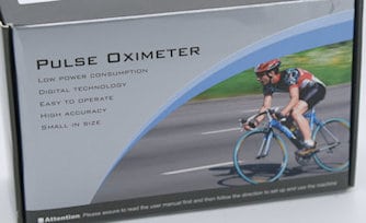
As seen below, the product purchased had no branding at all. Is that model OEM or not intended to be purchased as we did it?
Product Design
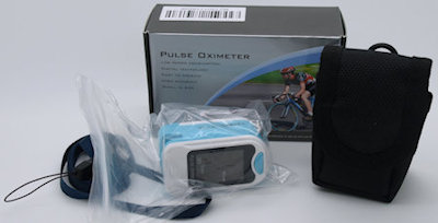
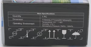
Packaging & accessories
Well, small & compact. Not much to say about its design, except targeted for being low cost.
But for that price, it still delivers a strap and a basic thin bag, possibly to be attached to the belt. The product itself is well protected
From the pictures, it’s targeting obviously sports applications although the text mentions hospitals & home-care applications.
We have some doubt that the product can efficiently be used on bicycles, especially as seen after the reading of value is the opposite way, values meant to be read by somebody in front of the patient.

Instruction for Use (IFU)
Review here as part of the product and the assembly BOM
In English only, printed on double side A3 with nice easy-to-read big font size
This becomes uncommon: the (bad) tendency of most brands is to fit as much text and languages as possible in the smallest paper as possible, thus becoming unreadable, especially by older patients
As on the main box (and also later on the main product), not one reference of the manufacturer name, nor its location, not any notified body.
Although it is mentioned “The User Manual is published by our company. All right reserved” … but which company?
Apart from that, a typical section of a medical device’s IFU:
- overview
- installation & usage
- specifications including accuracy
- troubleshooting
- symbols
- a huge list of warnings, including cleaning
To be noticed: a nice explanation of the principle of %SpO2 blood measurement
Main product design
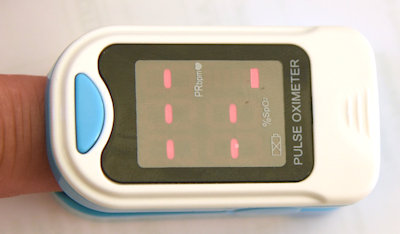
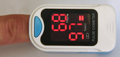
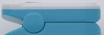
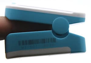
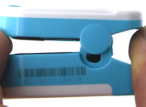
All plastic parts do well fitted together, without clearance of any gaps box for fixed parts (top LCD frame) as for the removable battery cover. No screw is visible and the main clips are well hidden (see details pictures gallery below).
As in this product family, the design mainly consists of the two articulated parts pinching the finger. The electronic is on the top part with the emitting diode over the nail, while the batteries and the receiver sensor are on the bottom part, underneath the finger.
The main complexity of the mechanical design is to achieve good contact with both surfaces of the finger while being versatile enough to accommodate large variations in finger size.
This is achieved by the two soft rubbers and a versatile joint and its springs.
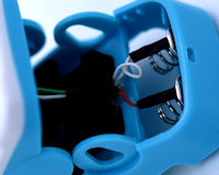
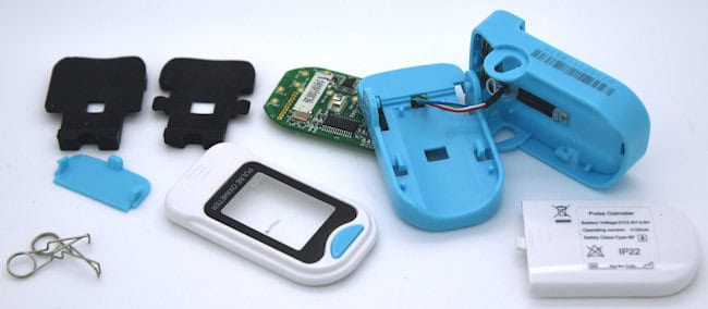
All electronics, including the custom LCD, is fitted on a double-side PCB, attached to the plastic body by clips like on mobile phones some years ago.
Even, taking calibration into consideration, the PCB has surprisingly a large amount of Testing Points.
Cables are as short as possible, and all-welded, thus limiting signal noise and loose connections.
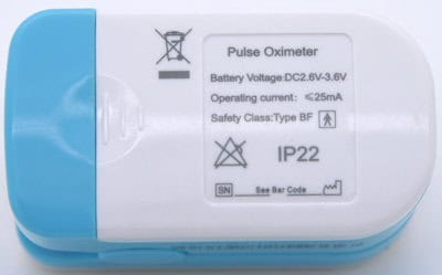
The main markings are printed on the battery cover, with the main reference of serial number and manufacturing linking to the barcode on the side … which is not understandable as is. There would have been enough space on this cover to make a full detailed marking.
from a general design point of view: for durability and traceability reasons, simply avoid putting important or legal markings on easily removable parts such as a cover.
…. unless these markings are intentionally made to be exchangeable (which could be handy for variants, OEM, or stock reasons, but would not pass a decent risk analysis)
Detailed components gallery
Conclusion
Overall the main design of the product is constructed around the battery’s standard size and the finger size. In that aspect, it is similar to the headlamp design reviewed.
We have a mixed feeling about this product
Is it really a low-cost product?
From the price segment, for sure yes it’s a low-cost product, both for a sport & leisure market, and even more for a pro-medical device market.
It arrived in Europe for €6.5 + 2.5€ for shipping, 10 days after ordering, while typical brands would sell what looks like be a similar product for at least x20 more, shipping excluded and possibly in a longer lead–time
But apart from the important regulation drawbacks (see below), this product is well designed, well packaged, well assembled, and does work well -at least during the time tested-; it could well bear the comparison with well known-western-brands.
But on the other side
…mmmh … pro-western pro users will definitively have some concerns here.
European Medical Device Directive (“MDD”) or Food and Drug Administration (FDA) approvals is a question, and at least not indicated nor in the package or on the product or on the IFU.
- Company is mandatory
- Product ref is mandatory
- Notified Body is mandatory
and related medical approvals and quality systems supervising its development, production, logistics, traceability, and market surveillance.
At least we have not seen on this product a warning as seen on other eastern made products (spelling & colors are original):
“This is supplementary medical equipment and is not intended for serious disease or those who stay alive solely on medical oxygen.“
Note: although this product family is not delivering drug, it’s measurements may be used to take medical decisions. So that product family is definitively classified as medical devices.
Possible design improvements
From mechanical engineering, well done! Very small observations
From a manufacturing point of view:
- it would have been easy to use the same elastomer on the top and bottom sides, although the volumes involved can likely afford an additional small mold
- manual welding of the wire + the droplet of hot glue to fit the sensor + placing the 2 springs are likely the (very)...
You have read 60% of the article. The rest is for our community. Already a member? Log in
(and also to protect our original content from scraping bots)
Innovation.world community
Login or Register (100% free)
View the rest of this article and all members-only content and tools.
Only real engineers, manufacturers, designers, marketers professionals.
No bot, no hater, no spammer.


