Good shelve positioning is key for selling in supermarkets where competition is tough. Here can designers come into play for the Packaging Design: breakfast cereals or milk are by nature -not too expensive- big boxes, making the positioning even more difficult, as supermarkets tend to promote the highest value products in good ergonomic middle shelf positions, but taking as less width as possible.
And for this, many strategies are possible to differentiate and win a good position on the shelf in a competitive supermarket environment. We suggest here some nice ones, both smart and nice.
Two sides Packaging Design
See how this brand found a nice packaging layout, not compromising the brand or the image quality
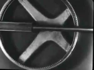
This is the same box, with both sides usable as the front side even if turned 90°:


Both sides of the package maintain a good visual identity by repeating the main attractive rooster visual + the brand logo + the size (500g) + nutrition facts in a correct horizontal orientation, although the box has been turned 90°.
That permit a shop position both:
- on the highest row, where package height does not matter much (hard to grab)
- or in a middle row, where product height is more limited but is the position that manufacturers fight for (much more accessible to the customer’s vision and arm to grab it)
The main legal text information is on the sides to keep a slick nice design. A bit of a question is why the nutrition facts are so visible in the two front faces. Is it a regulatory or a marketing argument? Does it help the product to appear “more technical”?
Smart 4 Sides Packaging Design
To a similar question as the packaging above, the Russian branding agency depot proposed an original solution, using the 4 sides of the traditional milt pack (all images ©depot):

- The cat head is nice already in the standard front face position (if the position is traditional), with increased eyeballs like a manga, looking straight into the eyes of the future buyer (can you hear it meowing “buy me!” ?).
- when the 4-part “puzzle” is in place, the total image is much bigger to appeal to the customer, at zero shelf width or packaging cost
Note that the image has 3 versions of the cat. Depot has made also variants of this blue cat for a full range of related products.
Tip: if the middle “section” of the cat would have the same height on the right and on the left, by repeating this middle section several times, the total image could be even bigger! (would look more natural if no cat legs in this repeated section)
Have you seen other smart Packaging Designs? Suggest on the right