Color coding has been utilized for centuries as a means to communicate information quickly and effectively. Historically, ancient civilizations employed color distinctions in various contexts, such as in maps and heraldry, to signify different territories or family lineages. In modern engineering and manufacturing, color coding serves a critical role in simplifying complex processes, minimizing errors, and enhancing safety protocols.
For example, electrical wiring often follows a color-coded system to indicate different functions, such as black for live wires and white for neutral, thus ensuring proper installation and maintenance.

Product designers and marketers can use color coding for 3 reasons:
- to convey a message
- to convey a feeling
- to easily distinguish between elements.
As such this design trick should be used as frequently as possible in any virtual or physical creation, such as GUI, road signs, toys, tools, or safety equipment to improve ergonomics.
In combination with other senses such as shape, sound, and others, color coding usage is applicable in product designs so as in any lean process to mark factory equipment, but also offices and public areas.
Color Coding To Convey a Message

In product design, color coding enhances user interaction by providing visual cues that facilitate understanding and usability.
A example can be found in consumer electronics, where buttons may be color-coded to denote their functions. For instance, a red button might indicate a power or emergency function, while a blue button could be reserved for standard operations. This immediate recognition aids users in achieving their objectives with minimal confusion, which can be particularly beneficial in high-stress situations or for individuals with varying levels of expertise.
Manufacturing environments often employ color coding on machinery and tools to promote safety and efficiency. For example, different colors may represent specific tools or equipment types, enabling workers to quickly identify and select the appropriate items for their tasks. This practice not only enhances workflow but also reduces the likelihood of accidents by clearly delineating hazardous areas or components. Industries such as automotive and aerospace have adopted these strategies extensively, utilizing color-coded labels and systems to adhere to strict regulatory standards while optimizing operational efficiency.
Color coding is one of the methods to convey important messages or instructions, in the visual family of all 6 senses.
The objective is to pass a message in the most efficient way, with colors having the advantage of being fast, not requiring too many reading capabilities (children… ) & international (no translation needed)
Standardized Color Codings

These systems utilize specific colors to convey particular messages or indicate specific conditions, enhancing clarity and reducing the likelihood of misinterpretation. For instance, in the context of safety signage, colors such as red, yellow, and green are typically used to represent warnings, caution, and safety, respectively. This uniformity allows individuals to quickly and accurately comprehend the intended message, thereby improving response times in critical situations.
The implementation of standardized color codes also streamlines the manufacturing and assembly processes, as workers can identify components, tools, and instructions at a glance.
- Using a consistent color coding scheme across different products and environments minimizes the cognitive load on employees, enabling them to focus on task execution rather than deciphering varied color meanings.
- Adherence to established standards can facilitate compliance with regulatory requirements, ensuring that signage and labeling meet safety guidelines while promoting a cohesive brand identity through visual consistency.
For signs or to convey a message, refer to
ISO 3864-3:2012: Graphical symbols — Safety colors and safety signs — Part 3: Design principles for graphical symbols for use in safety signs
complemented by:
ISO 3864-4:2011: Graphical symbols — Safety colors and safety signs — Part 4: Colorimetric and photometric properties of safety sign materials
Other particular regulations will refer to or follow these rules, like the medical industry for its labels or machine or equipment directives for all colored warnings and safety measures.
Usual Color meanings
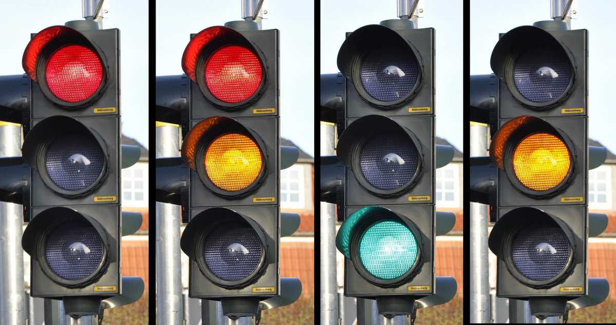
Red & Green

the most frequently used, as
- Go/NO GO
- OK/NOT OK
- WORKING/NOT WORKING
and less frequently as Danger / Safe
Yellow

The general warning color
- Usually used alone as a “Work in progress” message
- Or used in combination with black in stripes (“danger zone”)
Blue
Blue can be misleading in everyday usage:
- Notice that only the traffic rules sign or in ISO standards is blue the color of mandatory instructions
Would you say that the Facebook, Twitter, and LinkedIn blue logos convey a mandatory instruction message?
- In everyday life, logos or products, the blue color is usually related to innovation or the future as seen in the video below
White / Black
Should be used with care, if the color itself needs to carry a message; they are mainly understandable if the opposite is also visible (like a boolean/yes-no message), as both could be a text or the background.
Tip: remember the old graphic rule that the dark supersedes, or overflows visually, on the light: a black bar on white background, will appear thicker than a white bar on a black background, even if the thickness is the same.
up to 3 different colors does help the ergonomics, 4-5 is a design challenge, and more than 5 is usually counterproductive
Tip: mind the background of the product: it should already count as one color to distinguish from if it is not white or black!
Color Coding to Convey a Feeling
Color coding in product design serves as a critical tool for conveying emotions and guiding user interactions. Various cultures attribute specific meanings to colors, influencing consumer perceptions and behaviors. For instance, blue often signifies trust and reliability in Western cultures, while red can evoke feelings of excitement or urgency. Historical contexts also shape these associations; for example, green, often linked to nature, can symbolize prosperity and health due to its connection with agriculture. Psychological studies suggest that colors can affect mood and cognition, impacting decision-making processes. Consequently, the choice of color in product design must consider these cultural, historical, and psychological factors to effectively communicate the intended message and enhance user experience.
Cultural or local exceptions: color coding in product design and engineering often requires careful consideration of cultural contexts, particularly with black and white colors, which carry varied meanings across different societies. In many Western cultures, black is frequently associated with mourning and sadness, while in other cultures, such as some African traditions, it can signify maturity and wisdom. Conversely, white is commonly linked to purity and peace in Western contexts, yet in certain Asian cultures, it is associated with death and loss.

These contrasting interpretations necessitate that designers and manufacturers conduct thorough research into local customs and sentiments to avoid miscommunication and ensure that products resonate positively with their intended audiences. Understanding these cultural nuances is essential for creating products that align with local values and expectations.

As an example, these beautiful houses in the picture on the left: while the scenery is magnificent and do convey big emotions, such a mix of dull colors should not be used to convey an informative message in product design on the right.
The rest of this article is reserved for members
To limit scraping bots (currently 40,000 hits per day!),
we had to restrict access to full articles and tools to registered members only.
to access all the rest.