In the 1990s, Nielsen and Molich created 10 user interface guidelines. These guidelines are key in how we design graphic user interfaces today. They help us make interfaces that are easy to use and understand, improving how users interact with digital platforms. A good user interface combines beauty with practicality, making it simple for people to use software or apps.
One of those guidelines asks for aesthetic and minimalist dialogues, a direct application of less is more design, because every extra element competes with the relevant ones. The less is more design principle keeps interfaces readable.
मुख्य बातें
- नीलसन और मोलिच के दिशानिर्देश आधुनिक ग्राफिक यूजर इंटरफेस डिजाइन में अभी भी प्रासंगिक हैं, जो डिजाइनरों को अधिक सहज इंटरफेस की ओर मार्गदर्शन करते हैं।
- इन स्थापित सिद्धांतों को शामिल करने से सुधार हो सकता है उपयोगितासॉफ्टवेयर अनुप्रयोगों में उपयोगिता और वांछनीयता।
- User interface design should focus on minimizing user effort and maximizing satisfaction.
- Consistency and familiarity in layout and terminology help users acclimate quickly to new interfaces.
- प्रभावी फीडबैक तंत्र और त्रुटि निवारण एक सुचारू प्रक्रिया बनाने में महत्वपूर्ण भूमिका निभाते हैं। प्रयोगकर्ता का अनुभव.
Introduction to GUI Design
In the tech world, GUI design matters a lot for creating useful and good-looking apps. Knowing the basic principles helps designers make interfaces that improve user experiences. This support also builds brand loyalty.
What is GUI Design?
जीयूआई डिजाइन का अर्थ है यूजर इंटरफेस के दृश्य भागों पर काम करना। डिजाइनर मेनू और बटन जैसे ऐसे तत्व बनाते हैं जो सरल और उपयोग में आसान होते हैं। एप्पल मैकिंटोश, जिसने आइकन और माउस क्लिक जैसी सुविधाएं पेश कीं, ने उच्च मानक स्थापित किए।
The Importance of Intuitive Interfaces
सहज इंटरफेस उपयोगकर्ताओं के लिए कार्यों को करना आसान बनाते हैं। वे किसी उत्पाद और कंपनी की सफलता में भी बड़ी भूमिका निभाते हैं। ज़ेरॉक्स स्टार का उदाहरण लें: यह पहले ग्राफिकल यूजर इंटरफेस के साथ आया था लेकिन बाजार में असफल रहा। स्टीव जॉब्स इससे प्रेरणा लेकर एप्पल लीसा और मैकिंटोश बनाए गए, जो काफी सफल रहे। ध्यान दें कि विंडोज 95 का ग्राफिकल यूजर इंटरफेस, अपनी कमियों के बावजूद, स्मार्ट डिजाइन की आवश्यकता पर बल देता था।
It’s also key to understand concepts like affordance. Affordance means something looks usable, while false affordance leads users astray. Nielsen and Molich’s guidelines stress lessening mental strain and keeping things consistent. This makes interfaces easy to get used to.
Following these design rules helps make applications focused on the user. They not only work better but also make users happier and more loyal. The goal, no matter the system, is smooth interaction and a great experience for the user.
Key Principles of GUI Design
उपयोगकर्ता के अनुकूल डिजिटल उत्पाद बनाने की शुरुआत अच्छे ग्राफिकल यूजर इंटरफेस (जीयूआई) डिजाइन से होती है। इसमें सहज और आकर्षक दृश्य इंटरफेस प्रदान करना शामिल है। इसका मुख्य उद्देश्य उपयोगकर्ता के अनुभव को बेहतर बनाना है।
सादगी
ग्राफिक यूजर इंटरफेस (GUI) डिजाइन में सरलता का अर्थ है सब कुछ सीधा-सादा रखना। इससे उपयोगकर्ता सहजता से बातचीत कर पाते हैं। इंटरफेस तभी उपयोग में आसान होते हैं जब वे अव्यवस्थित न हों। डिजाइनर इसी सरलता को लक्ष्य बनाकर चलते हैं। इससे उपयोगकर्ता बिना किसी परेशानी के चीजों को एक्सप्लोर कर पाते हैं।
रखना डिजाइन सरल इससे उपयोगकर्ता संतुष्टि बढ़ती है। यह वेबसाइटों और ऐप्स दोनों के लिए सच है। सरलता यह सुनिश्चित करती है कि उपयोगकर्ता डिजिटल प्लेटफॉर्म पर अपने समय का आनंद लें।
Consistency
ग्राफिक यूजर इंटरफेस (GUI) डिजाइन में एकरूपता बहुत मायने रखती है। इसका मतलब है हर चीज को एक समान रखना। इसमें रंग संयोजन, टाइपोग्राफी और आइकन शामिल हैं। जब ये तत्व एक समान होते हैं, तो उपयोगकर्ता अधिक सहज महसूस करते हैं। इससे उन्हें बेहतर नेविगेशन में मदद मिलती है।
अच्छा डिज़ाइन हर जगह इस एकरूपता को बनाए रखता है। वेब और ऐप डिज़ाइन दोनों में यही होना चाहिए। इसी तरह आप उपयोगकर्ताओं को खुश रख सकते हैं और उनकी निराशा को कम कर सकते हैं।
Feedback
Feedback is a key part of GUI design. It lets users know the results of their actions. This could be through visuals, sounds, or vibrations. Good feedback helps users feel in control.
It builds trust by creating intuitive experiences. Users need this to navigate confidently.
Hierarchy
पदानुक्रम उपयोगकर्ताओं को महत्वपूर्ण बातों की ओर निर्देशित करता है। यह जोर देने के लिए आकार, रंग और स्थान का उपयोग करता है। इससे उपयोगकर्ताओं के लिए समझना और उस पर अमल करना आसान हो जाता है।
Having a strong visual hierarchy is essential. It allows users to quickly get information and decide.
User-Centered Design Approach
द उपयोगकर्ता केंद्रित डिजाइन दृष्टिकोण उपयोगकर्ताओं की आवश्यकताओं और अपेक्षाओं पर केंद्रित है। यह उन्हें डिजाइन प्रक्रिया के केंद्र में रखता है। अनुसंधान के माध्यम से, उपयोगकर्ता व्यक्तित्वऔर उपयोगकर्ता प्रवाह के साथ, उत्पाद अपने लक्षित उपयोगकर्ताओं के लिए अच्छी तरह से उपयुक्त होते हैं।

User Research
व्यापक उपयोगकर्ता अनुसंधान प्रभावी उपयोगकर्ता-केंद्रित डिज़ाइन की नींव रखता है। टीमें सर्वेक्षण, साक्षात्कार और सोशल मीडिया के माध्यम से डेटा एकत्र करती हैं। ये विधियाँ उपयोगकर्ताओं के अनुभवों और धारणाओं को उजागर करती हैं। प्रत्यक्ष जुड़ाव उपयोगकर्ताओं के व्यवहार और आवश्यकताओं की गहरी समझ प्रदान करता है। यह वास्तविक दुनिया की आवश्यकताओं को पूरा करने वाले डिज़ाइनों के लिए अत्यंत महत्वपूर्ण है।
User Personas
उपयोगकर्ता-केंद्रित डिज़ाइन में उपयोगकर्ता पर्सोना महत्वपूर्ण भूमिका निभाते हैं। ये काल्पनिक होते हैं, लेकिन वास्तविक उपयोगकर्ता डेटा पर आधारित होते हैं। पर्सोना डिज़ाइन को महत्वपूर्ण उपयोगकर्ता समूहों पर केंद्रित रखते हैं। इनमें आयु और लक्ष्य जैसी जानकारियाँ शामिल होती हैं, जिससे डिज़ाइन को उपयोगकर्ता के अनुरूप बनाया जा सके। इससे यह सुनिश्चित होता है कि डिज़ाइन उपयोग में आसान है और विभिन्न उपयोगकर्ताओं की आवश्यकताओं को पूरा करता है।
User Flows
उपयोगकर्ता प्रवाह मानचित्रण डिजाइन के माध्यम से उपयोगकर्ताओं के पथ को रेखांकित करता है। यह यात्रा को दृश्य रूप में प्रस्तुत करता है, जिसका उद्देश्य सहज और सरल अंतःक्रियाएं सुनिश्चित करना है।
By predicting user paths, designers can remove hurdles.
This leads to a better user journey. Detailed user flows highlight areas to boost engagement. They make interactive designs more satisfying and efficient.
A user-centered design approach improves GUI usability, satisfaction, and engagement. By prioritizing real user needs and involving them, products are both functional and impactful.
Visual Hierarchy in GUI Design
दृश्य पदानुक्रम तत्वों को व्यवस्थित करके उपयोगकर्ताओं का ध्यान प्रमुख क्षेत्रों की ओर निर्देशित करता है। आकार, रंग और स्थान निर्धारण का उपयोग करके यह ग्राफिकल यूजर इंटरफेस (GUI) को बेहतर बनाता है। एर्गोनॉमिक्सचूंकि हमारी आंखें सबसे पहले दृश्यों को देखती हैं, इसलिए उपयोगकर्ता इंटरफेस के लिए एक सुव्यवस्थित डिजाइन महत्वपूर्ण है।
- Size: बड़े तत्व अधिक ध्यान आकर्षित करते हैं, जिससे पता चलता है कि क्या महत्वपूर्ण है।
- Color: चटख रंग उभरकर सामने आते हैं और ब्रांड की भावना को दर्शाते हैं, जिससे लोगों की निगाहें आकर्षित होती हैं।
- Alignment: lined-up items create a neat visual flow, guiding the viewer.
- Repetition: repeating designs makes things familiar and points to linked info.
- Proximity: items close to each other seem related, making content clear.
- Whitespace: space around stuff makes it easier to read and highlights areas.
- Texture & Style: textures draw the eye to key spots and evoke feelings, adding layers to the UI.
Here are common layout patterns:
- Z Pattern: great for sites with little text, eyes move from top-left to bottom-right.
- F Pattern: works well for sites with lots of content, eyes sweep left to right, then down on the left side.
Getting these concepts right helps in making visual design work better. This, in return, boosts GUI ergonomics. In the end, it leads to interfaces that are easy and pleasant to use.
| Factor | Impact on Visual Hierarchy |
|---|---|
| Size | Bigger elements stand out |
| Color | Bright colors catch the eye, show brand vibe |
| Alignment | Makes a clean visual order |
| Repetition | Brings comfort, signals related things |
| Proximity | Tells which elements are together |
| Whitespace | Makes content readable, highlights parts |
| Texture & Style | Emphasizes key areas, adds depth |
Effective Use of Whitespace
GUI डिज़ाइन में, खाली स्थान का समझदारी से उपयोग करने से उपयोगकर्ताओं के इंटरैक्शन का तरीका पूरी तरह बदल सकता है। यह सरल डिज़ाइन विधि यूजर इंटरफेस को साफ-सुथरा रखती है। इससे उपयोगकर्ता अनुभव बेहतर होता है। मज़ा और कुशल।
Creating Focus
खाली स्थान, जिसे नेगेटिव स्पेस भी कहा जाता है, उपयोगकर्ता का ध्यान मुख्य भागों की ओर केंद्रित करता है। अध्ययनों से पता चलता है कि खाली स्थान का समझदारी से उपयोग करने से पाठ को पढ़ना 20% तक आसान हो जाता है। यह पैडिंग और मार्जिन का उपयोग करके सबसे महत्वपूर्ण भाग को उजागर करता है।
Whitespace makes things look grouped if they are close. This is the law of proximity. Apple uses whitespace well to spotlight product features, creating a luxury feel. Whitespace around important elements can boost conversions by 30%. This shows its power in focusing user attention.
Avoiding Clutter
A clean interface, made with minimalist design, improves cleanliness. Research by the Nielsen Norman Group (NNG) says whitespace guides eyes and organizes content. Too much clutter makes people frustrated and distracted from the main message.
A grid system, used by 70% of UI designs for whitespace, keeps things orderly. Managing whitespace well keeps content organized and flowing, especially on long-scroll websites. Websites using whitespace well see a 40% jump in user engagement. Less really is more.
For mobile apps, whitespace is key too. Apps that are clean and not cluttered get a 25% higher user retention. This shows the importance of whitespace in making things easy to read and reducing clutter. This keeps the user experience positive.
| लाभ | सांख्यिकी |
|---|---|
| Increased Readability | 20% improvement (Wichita State University) |
| Higher User Engagement | 40% increase |
| Increased User Retention (Mobile Apps) | 25% improvement |
| Higher Conversion Rates | 30% increase |
| Improved Trust and Professionalism | 65% of users’ perception |
Focus on whitespace boosts user interface cleanliness and user satisfaction. The right balance of content and whitespace makes a GUI that feels right to users. It matches well with their needs.
Consistency and Standardization
Adhering to consistent design principles helps users trust and enjoy the platform more.
Consistent Layouts
Maintaining consistent layouts helps users navigate easily. Things like consistent typography, colors, and buttons are crucial. By using reusable UI elements, platforms like Adobe Photoshop and Gmail offer a familiar experience that users appreciate.
Standardized Navigation Menus
Navigation menus guide users through a website or app. Using standardized elements makes functionality clear. For example, Gmail uses consistent labels, making it easy to use.
| Design Element | Consistency Benefit | Example |
|---|---|---|
| Typography | Improves readability and design quality | हेडर और बॉडी टेक्स्ट के लिए जीमेल की सुसंगत टाइपोग्राफिक शैली |
| Color Palette | Establishes strong brand identity | एडोब फोटोशॉप की सुस्पष्ट रंग योजनाएँ |
| Buttons and Icons | Enhances user recognition and understanding | Reusable UI components in applications like React projects |
| Navigation Bars | Creates seamless user experience | YouTube का सुसंगत वीडियो प्लेयर डिज़ाइन |
Importance of Feedback Mechanisms
Feedback mechanisms are critical in the design of graphical user interfaces (GUIs). They ensure users get quick responses to their actions. This creates a smooth interaction experience.
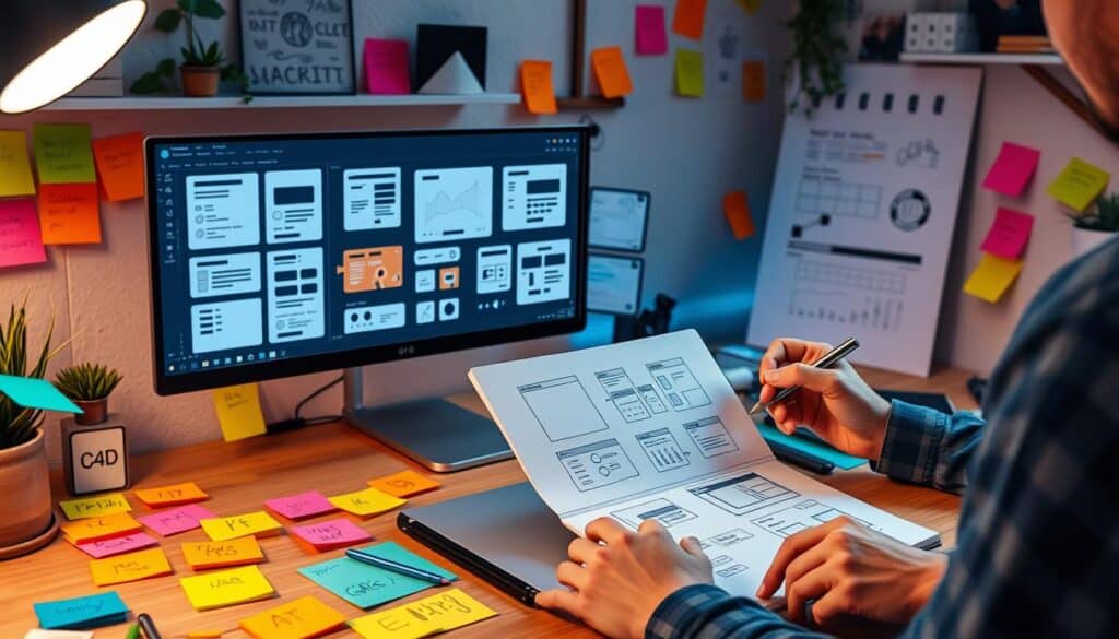
Designs that meet user expectations boost satisfaction, loyalty, and engagement.
Yet, dealing with lots of feedback can be tough. It may involve hundreds or thousands of comments. User segmentation, A/B testing, and interviews help deal with mixed feedback. It’s also crucial to check if the feedback is relevant through profiling and analysis.
| Mechanism | फ़ायदा | Example |
|---|---|---|
| Pre-loaders | Reduces abandonment rates | Spinning wheels, animations |
| In-app Prompts | Increases user engagement | Tooltips, action messages |
| Progress Bars | Encourages task completion | Signup, onboarding flows |
| Contextual Feedback | Enhances user guidance | Error messages, button color changes |
| Visual Feedback | Improves interactive elements | Button animations, notifications |
Good feedback mechanisms include changing button looks during use, instant messages for forms, and loading signs and respect these rules:
- clear messages for success or errors
- Adding physical responses, with other senses, like vibrations on phones, is helpful too.
- should be given right after a user does something to avoid confusion
- Using the same feedback patterns helps users
Testing these mechanisms with users and updating them based on observations is key. It ensures they meet user needs well.
Accessibility in GUI Design
Making GUI design accessible is not only about following the law. It also makes sure applications and websites work well for people with different abilities. Designers who focus on making their work inclusive create welcoming interfaces. This lets more people use their products.

Color Contrast
सभी के लिए, विशेषकर दृष्टिबाधित लोगों के लिए, अच्छा रंग कंट्रास्ट होना बहुत महत्वपूर्ण है। WCAG के अनुसार, टेक्स्ट और बैकग्राउंड का कंट्रास्ट अनुपात कम से कम 4.5:1 होना चाहिए। यह नियम कमज़ोर दृष्टि वाले लोगों को बेहतर ढंग से पढ़ने में मदद करता है और लेवल AA मानकों को पूरा करता है।
Different levels of accessibility show how well a design meets these standards:
- Level A (Priority 1): इसमें बुनियादी पहुंच संबंधी सुविधाएं शामिल हैं – अनुपालन के लिए न्यूनतम आवश्यक सुविधाएं।
- Level AA (Priority 2): this is often the legal minimum in places like the US and Canada.
- Level AAA (Priority 3): the top standard for accessibility.
In places like Toronto, laws require even tougher standards with Level AA. This makes sure websites can be used by more people.
Screen Reader Compatibility
स्क्रीन रीडर के साथ काम करना ग्राफिकल यूजर इंटरफेस (जीयूआई) को सुलभ और समावेशी बनाने का एक महत्वपूर्ण हिस्सा है। WCAG में ऐसे नियम हैं जो यह सुनिश्चित करते हैं कि शीर्षक, लेबल और सामग्री का क्रम स्क्रीन रीडर उपयोगकर्ताओं के लिए स्पष्ट हो। ये नियम सामग्री के अर्थ को स्पष्ट रखने में मदद करते हैं।
When making a website work well with screen readers, remember to:
- Use clear labels for forms and controls.
- Keep content in a logical order.
- Give non-text elements descriptive alt text.
Following these tips helps people using screen readers to navigate and understand the interface easier.
| Accessibility Level | Requirements | उदाहरण |
|---|---|---|
| Level A (Priority 1) | Basic features for the least compliance. | Alt text for images, content in a meaningful order. |
| Level AA (Priority 2) | Minimum legal standard in the US and Canada. | Color contrast ratio of 4.5:1, clear headings. |
| Level AAA (Priority 3) | The highest accessibility level. | Better contrast ratios, more alt text, logical content structure. |
Using these guidelines helps make interfaces that are easier to use for everyone. This benefits both users and companies.
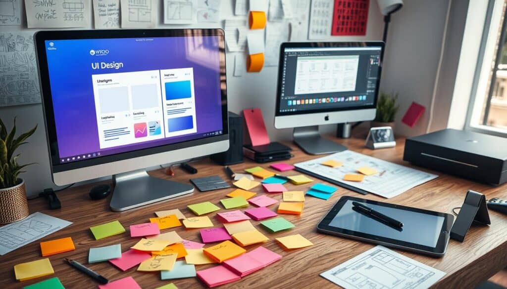
Testing and Iteration in GUI Design
Good GUI design needs constant testing and updates. This makes sure the interface works well for users. It keeps usability high.
उपयोगिता परीक्षण
उपयोगिता परीक्षण उपयोगकर्ता के अनुभव पर केंद्रित होता है। डिज़ाइनर समस्याओं का पता लगाने के लिए उपयोगकर्ताओं द्वारा इंटरफ़ेस के उपयोग को देखते हैं। कुछ ही प्रयासों के बाद उपयोगिता में 200% तक सुधार हो सकता है।
वे देखते हैं कि उपयोगकर्ता कितने खुश हैं, उन्हें कितना फायदा होता है। जुड़ते हैंऔर रूपांतरण दरें। लेकिन, छोटे परीक्षण समूह या फीडबैक को अनदेखा करना परीक्षण को बिगाड़ सकता है।
A/B Testing
A/B testing compares two design options. It shows which design users like more. This helps make better design choices.
Testing your design against others gives insight into user actions. Always remember ethics like transparency and privacy.
Text, Image, and Video in GUI
Combining text, images, and videos in GUIs makes them more fun and interactive. This blend makes interfaces not just good-looking but dynamic too.
ग्राफिक यूजर इंटरफेस (GUI) में कंटेंट को बेहतर तरीके से प्रदर्शित करना बेहद जरूरी है। उदाहरण के लिए, Apple के iOS और Google के Android को लें। ये टेक्स्ट, इमेज और वीडियो का इस्तेमाल करके बेहतरीन अनुभव प्रदान करते हैं। इनके डिजाइन हमें बेहतर इंटरैक्शन के लिए सरल जेस्चर का उपयोग करने की सुविधा देते हैं।
ग्राफिक यूजर इंटरफेस (जीयूआई) में टेक्स्ट, इमेज और वीडियो का मिश्रण गैजेट्स के साथ हमारे इंटरैक्ट करने के तरीके को बदल देता है। यह पुराने जमाने के कमांड्स की तुलना में कहीं अधिक मजेदार और आसान है।
Special GUIs like in ATMs or kiosks also benefit. They use text and images to talk clearly and quickly. For cars, video helps with live directions and maps.
| Application | Example | Key Usage |
|---|---|---|
| Banking | ATM Screens | Text and Icon Navigation |
| Retail | POS Systems | Image-based Touch Menus |
| ऑटोमोटिव | Multimedia Displays | Video for Real-Time Navigation |
Aesthetics vs. Functionality
आकर्षक डिज़ाइन उपयोगकर्ताओं को लुभाता है, लेकिन केवल सुंदरता पर ध्यान केंद्रित करना उन्हें निराश कर सकता है यदि वह उपयोगी न हो। बेहतरीन डिज़ाइन इन तत्वों को मिलाकर ऐप्स को आकर्षक और उपयोग में आसान बनाता है।
Balancing Visual Appeal and Usability
एक संतुलित इंटरफ़ेस बनाने के लिए आकर्षक डिज़ाइन और उपयोगिता का सही मिश्रण आवश्यक है। यदि कोई ऐप देखने में अच्छा लगे लेकिन ठीक से काम न करे, तो लोग उसे लंबे समय तक इस्तेमाल नहीं करेंगे।
By mixing functional design और aesthetic interfaces, GUI becomes attractive and practical.
The balance is crucial for several reasons:
- User research helps understand needs, improving looks and function.
- सूचना वास्तुकला इससे नेविगेशन अधिक स्पष्ट हो जाता है, जिससे कार्यक्षमता में सहायता मिलती है।
- Sketches and prototypes emphasize usability before adding visual touches.
- User testing checks if the app meets expectations in both looks and function.
Prioritizing Function
Though good looks are important for branding, function keeps users coming back. Some banking apps or mail apps may not look great but work so well, people keep using them. This shows how vital functional design is for keeping users happy.
Below is a table showing key points of function and aesthetics:
| पहलू | विवरण |
|---|---|
| Functionality | यह कार्यकुशलता, विश्वसनीयता और उपयोगिता सुनिश्चित करता है। यह जुड़ाव बनाए रखने के लिए महत्वपूर्ण है। |
| Aesthetic | Draws users in with beauty, making a strong first impression. |
| Balance | Mixing both elements is vital for the best experience. |
To sum up, effective GUI design needs a careful balance of functional design and aesthetic interfaces. This blend not only grabs attention but also makes apps useful and friendly to users.
Handling Microinteractions
आज के ग्राफिकल यूजर इंटरफेस (GUI) डिजाइन में माइक्रोइंटरैक्शन महत्वपूर्ण भूमिका निभाते हैं। ये उपयोगकर्ताओं की गतिविधियों पर तुरंत प्रतिक्रिया देकर उपयोगकर्ता अनुभव को बेहतर बनाते हैं। इनमें स्क्रॉल बार और स्वाइप एनिमेशन जैसी चीजें शामिल हैं। ये उपयोगकर्ताओं की गतिविधियों पर प्रतिक्रिया करके सब कुछ सुचारू रूप से चलाने में मदद करते हैं।
Button Animations
बटन एनिमेशन महत्वपूर्ण इंटरैक्टिव तत्व हैं। ये उपयोगकर्ता द्वारा क्लिक करते ही प्रतिक्रिया देते हैं, जिससे अनुभव जीवंत हो उठता है। यह प्रतिक्रिया रंग परिवर्तन या उछाल प्रभाव हो सकती है। ये विवरण उपयोगकर्ताओं को मार्गदर्शन देते हैं, उन्हें दिखाते हैं कि वे सही दिशा में जा रहे हैं और उन्हें आसानी से नेविगेट करने में मदद करते हैं।
Progress Indicators
प्रगति संकेतक भी बहुत महत्वपूर्ण भूमिका निभा सकते हैं। ये दिखाते हैं कि कोई कार्य कितना पूरा हो चुका है, जिससे उपयोगकर्ता अपडेट रहते हैं। इसका एक उदाहरण लिंक्डइन का पुल-टू-रिफ्रेश एक्शन है, जिसे एक गोलाकार संकेतक के साथ दिखाया जाता है। इससे उपयोगकर्ता सूचित रहते हैं और प्रगति देखकर उन्हें उपलब्धि का अहसास होता है।
Microinteractions, like button animations and progress indicators, make user experiences better. By adding these, designers can make websites and apps more engaging and easier to use. This leads to happier users who enjoy interacting with the interface.
Common Mistakes in GUI Design
Designing a good Graphical User Interface (GUI) needs lots of thought. We must avoid common design pitfallsयह महत्वपूर्ण है कि उपयोगकर्ता को अच्छा अनुभव मिले, इसके लिए कुछ अनावश्यक चीजें न करें। GUI errors.
Overloading with Information
Putting too much info on the screen is a big mistake. This can make users feel lost and unhappy. To avoid this, we should order content well and make it easy to digest:
- Utilize bullet points to break up large blocks of text.
- Incorporate whitespace to help guide the user’s eye.
- Implement progressive disclosure techniques to reveal information as needed.
Adding too many features or visuals can make the main tasks harder to find. It makes the GUI less effective.
Inconsistent Design Elements
It’s important to keep your design elements consistent. If colors, fonts, and layouts change a lot, it can be hard to navigate. Here are ways to keep things consistent:
- Adopt a unified color scheme and style guide.
- Standardize the use of icons and imagery throughout the design.
- Ensure text hierarchy is consistent, using proper heading sizes and formats.
Keeping everything looking the same improves how easy and pleasant the GUI is to use.
| Mistake | प्रभाव | Correction |
|---|---|---|
| Overloading Information | Confuses users, reduces usability | Use whitespace, prioritize content |
| Inconsistent Design Elements | उपयोगकर्ताओं को भ्रमित करता है, खराब यूएक्स | Maintain a consistent style guide |
निष्कर्ष
ग्राफिक यूजर इंटरफेस (GUI) डिजाइन में महारत हासिल करने का मतलब है उपयोगकर्ताओं की जरूरतों को समझना। डिजाइन नियमों का पालन करना और लगातार परीक्षण करना महत्वपूर्ण है। उपयोगकर्ताओं के बारे में शोध करने से लेकर अंतिम रूप देने तक, हर छोटी से छोटी बात मायने रखती है।
इससे एक ऐसा इंटरफ़ेस बनाने में मदद मिलती है जो उपयोग में आसान और मजेदार हो। यह उपयोगकर्ताओं की जरूरतों को पूरा करने से कहीं आगे जाता है—यह उन्हें आश्चर्यचकित कर देता है।
Now, intuitive graphical user interfaces are (almost) everywhere.
These interfaces are much better than old text-based systems. They are easier to use, let us do many things at once, and help everyone, including those with disabilities.
आज की तकनीक में ग्राफिक यूजर इंटरफेस (GUI) डिजाइन बेहद महत्वपूर्ण है। यह हमारे द्वारा उपयोग किए जाने वाले सभी उपकरणों और सॉफ्टवेयर में मौजूद है। अच्छा GUI डिजाइन ऐप को अधिक लोगों तक पहुंचाता है, इसे उपयोग में आसान बनाता है और सीखने में लगने वाले समय को कम करता है।
Related Readings & Methods
- User Experience (UX) Design: Focuses on creating intuitive and seamless interactions within a GUI, ensuring user satisfaction and ease of use.
- User Interface (UI) Design: Involves the aesthetic design elements of a GUI, such as color schemes, typography, and layout.
- Interaction Design: Emphasizes the design of interactive elements and feedback mechanisms within a GUI to enhance user engagement.
- Information Architecture: Organizes and structures information within a GUI to facilitate easy navigation and access to content.
- Accessibility Design: Ensures that GUIs are usable by individuals with disabilities, incorporating features like screen readers and keyboard navigation.
- Responsive Design: Adapts GUIs to different devices and screen sizes, ensuring a consistent user experience across platforms.
- ह्यूमन कंप्यूटर इंटरेक्शन (एचसीआई): यह अध्ययन करता है कि लोग कंप्यूटर के साथ कैसे बातचीत करते हैं और इन अंतःक्रियाओं के आधार पर उपयोगकर्ता अनुभव को बेहतर बनाने वाले जीयूआई (ग्राफिकल यूजर इंटरफेस) को डिजाइन करता है।
- Usability Testing: Involves evaluating a GUI with real users to identify issues and areas for improvement, ensuring the interface is user-friendly.
अक्सर पूछे जाने वाले प्रश्न
What is GUI Design?
ग्राफिक यूजर इंटरफेस (GUI) डिजाइन का मुख्य उद्देश्य इंटरैक्टिव दृश्य तत्वों का निर्माण करना है। इसका लक्ष्य इन तत्वों को उपयोग में आसान और आकर्षक बनाना है। इससे उपयोगकर्ता का अनुभव बेहतर होता है।
What are the fundamental principles of GUI design?
मुख्य सिद्धांतों में चीजों को सरल और सुसंगत रखना शामिल है। स्पष्ट प्रतिक्रिया प्रदान करना और स्पष्ट लेआउट होना भी महत्वपूर्ण है। ये उपयोगकर्ताओं को महत्वपूर्ण बातों तक पहुंचने में मदद करते हैं।
What is a user-centered design approach?
This approach involves getting to know the users well. It means creating personas to represent them and designing flows that meet their needs. It ensures the GUI works well for the users.
How does visual hierarchy improve GUI design?
दृश्य पदानुक्रम आकार, रंग और स्थान का उपयोग करके सबसे महत्वपूर्ण चीज़ों को दर्शाता है। इससे इंटरफ़ेस को नेविगेट करना और उपयोग करना आसान हो जाता है। इससे उपयोगकर्ता अनुभव बेहतर होता है।
How can whitespace be effectively used in GUI design?
Whitespace makes the interface clean and focused. It avoids clutter, making things more readable. This helps users concentrate on their tasks.
Why is consistency important in GUI design?
Consistency makes interfaces predictable and easier to use. It helps build trust with users. This leads to a better and smoother experience.
What are feedback mechanisms in GUI design?
Feedback mechanisms include visual or auditory cues. They show users their actions have been noted. This helps guide them on how to use the interface correctly.
Why is testing important in GUI design?
टेस्टिंग से पता चलता है कि उपयोगकर्ता इंटरफ़ेस के साथ कैसे इंटरैक्ट करते हैं। इससे उपयोगकर्ता की प्रतिक्रिया के आधार पर सुधार किए जा सकते हैं। यह सुनिश्चित करता है कि ग्राफिकल यूजर इंटरफेस उपयोगकर्ताओं की आवश्यकताओं को पूरा करता है।
How can designers balance aesthetics with functionality in GUI?
Designers aim to create GUIs that look good and work well. A beautiful interface draws users in, but function keeps it easy to use.
What role do microinteractions play in GUI design?
Microinteractions, like animations, make interacting fun and informative. They offer feedback in a subtle way. This helps users complete their tasks more easily.
What are common mistakes to avoid in GUI design?
Overwhelming users with information is a mistake. So is being inconsistent. These can confuse users and harm the experience.
एर्गोनॉमिक्स और यूजर इंटरफेस पर बाहरी लिंक
अंतर्राष्ट्रीय मानक
- आईएसओ 9241-210: 2010 मानव-प्रणाली अंतःक्रिया का एर्गोनॉमिक्स – भाग 210: अंतःक्रियात्मक प्रणालियों के लिए मानव-केंद्रित डिज़ाइन
- आईएसओ 9241-11: 2018 मानव-प्रणाली अंतःक्रिया का एर्गोनॉमिक्स – भाग 11: उपयोगिता: परिभाषाएँ और अवधारणाएँ
- आईएसओ 13407: 1999 इंटरैक्टिव सिस्टम के लिए मानव-केंद्रित डिजाइन प्रक्रियाएं
(सामग्री का हमारा विवरण देखने के लिए लिंक पर होवर करें)
प्रयुक्त शब्दों की शब्दावली
Asynchronous Transfer Mode (ATM): यह एक उच्च गति वाली नेटवर्किंग तकनीक है जो डेटा ट्रांसमिशन के लिए निश्चित आकार के सेल का उपयोग करती है, जिससे विभिन्न मीडिया प्रकारों में कुशल और लचीला संचार संभव हो पाता है। यह वॉइस, वीडियो और डेटा सहित कई प्रकार की सेवाओं को सपोर्ट करती है, जिससे क्वालिटी ऑफ सर्विस (QoS) प्रबंधन आसान हो जाता है।
Conversion Rate (CR): किसी वेबसाइट या लैंडिंग पेज पर आने वाले आगंतुकों का वह प्रतिशत जो वांछित कार्रवाई पूरी करते हैं, जैसे खरीदारी करना या न्यूज़लेटर के लिए साइन अप करना, इसकी गणना रूपांतरणों की संख्या को कुल आगंतुकों की संख्या से विभाजित करके की जाती है।
Graphical User Interface (GUI): एक दृश्य इंटरफ़ेस जो उपयोगकर्ताओं को विंडोज़, आइकन, बटन और मेनू जैसे ग्राफिकल तत्वों के माध्यम से इलेक्ट्रॉनिक उपकरणों के साथ बातचीत करने की अनुमति देता है, जिससे पाठ-आधारित आदेशों की आवश्यकता के बिना सहज नेविगेशन और नियंत्रण सक्षम होता है।
Human-Computer Interaction (HCI): यह एक बहुविषयक क्षेत्र है जो मानव उपयोग के लिए इंटरैक्टिव कंप्यूटिंग सिस्टम के डिजाइन, मूल्यांकन और कार्यान्वयन पर केंद्रित है, जिसमें उपयोगिता, उपयोगकर्ता अनुभव और प्रौद्योगिकी के संबंध में उपयोगकर्ता के व्यवहार और प्राथमिकताओं के अध्ययन पर जोर दिया जाता है।
Point of Sale (POS): एक ऐसी प्रणाली जो ग्राहक और खुदरा विक्रेता के बीच लेन-देन को सुगम बनाती है, जिसमें आम तौर पर भुगतान प्रक्रिया, इन्वेंट्री प्रबंधन और बिक्री रिपोर्ट तैयार करने के लिए हार्डवेयर और सॉफ्टवेयर शामिल होते हैं। इसमें अक्सर कैश रजिस्टर, कार्ड रीडर और रसीद प्रिंटर जैसे घटक शामिल होते हैं।
User experience (UX): किसी उत्पाद, प्रणाली या सेवा के साथ बातचीत करते समय उपयोगकर्ता की समग्र संतुष्टि और धारणा, जिसमें संपूर्ण बातचीत प्रक्रिया के दौरान उपयोगिता, पहुंच, डिजाइन और भावनात्मक प्रतिक्रिया शामिल होती है।
User Interface (UI): एक ऐसी प्रणाली जो उपयोगकर्ताओं और सॉफ़्टवेयर अनुप्रयोगों के बीच अंतःक्रिया को सक्षम बनाती है, जिसमें उपयोगकर्ता कार्यों को सुगम बनाने और अनुभव को बेहतर बनाने के लिए दृश्य तत्व, नियंत्रण और समग्र लेआउट शामिल होते हैं।