Aaron Draplin &의 훌륭한 영상입니다. 링크드인 로고 디자인과 필요한 아이디어 및 콘셉트 연구에 대해 알아봅니다. 제공되는 많은 팁은 모든 창의적인 과정, 제품 디자인 및 아이디어 구상에도 적용할 수 있습니다.
로고 디자인 전문가 영상
아론은 개성이 강하고 소통 능력도 뛰어난 사람이지만, 우리의 조언과 팁을 드리기 전에 먼저 아이디어 구상 단계부터 시작하는 그의 업무 방식, 그리고 많은 제품 디자인 프로세스에 적용할 수 있는 '해야 할 일'과 '하지 말아야 할 일'에 집중해 보겠습니다.
먼저 '하드웨어'부터 살펴보겠습니다 🙂
'연필, 종이, 그리고 현장 노트의 마법'
로고 디자인
just pencil and paper at first! … to let any idea go through at least to some visual. Use software only after. And -like him- software with good 인간 공학 for most frequent tasks and that you master well does worth every cent.
작은 종이 노트: 어딘가에 보관해 둔 오래된 파일을 열어보지도 않고 잊어버리는 대신, 나중에 다시 볼 아이디어를 적어둘 수 있습니다. 게다가 여행 중이나 집에서 아이디어가 떠오르거나 무언가를 발견하면 몇 초 만에 메모를 추가할 수 있습니다.현장 기록“
Logo Design Methodology
before anything, write down what the customer wants to achieve or the message to convey (like in a design project, the product features)
and then, most important: try, try, (…) and try again and do not stop at the first you-think good idea:
make another variant (smaller, bigger, thicker, simpler, rotated, with different curves, fonts, orientation…)
place you in a situation or attitude where you surprise yourself / no boundaries here
use inspirational material (books, literature, website …), giving you not finished solutions but basic ones; go to the root of the concepts listed above
compare with others (previous tries, from the same sector, from different businesses, old or modern ..)
see from far, rotate the page, invert the colors
apply it to a real scenario, in context (paper letter, product, website, trucks, tee-shirt …)
take customer view, take competitor view
… and loop again until the budget or the time is over, but don’t be stopped by that if you are not satisfied. Nobody will thank you for s…t that met the budget
come together to a conclusion/choice (from our experience, this is the only step where you should restrict the selection to a few proposals to keep the focus and not disperse opinions)
a couple of proposals
together with why the designer came there & what is the thought behind
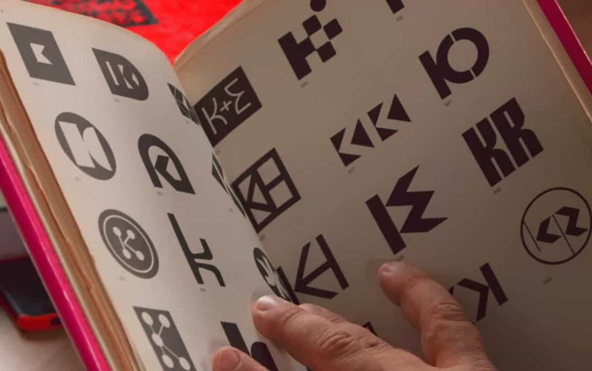
Trademarks and symbols, from yasaburo kuwayama
Recommended Books
Aaron recommends Trademarks and Symbols, from Yasaburo Kuwayama, in 1973, two Black and White content books:
Volume 1: Alphabetical Designs
Volume 2: Symbolical Designs
(English or Japanese; hard to find under $70 each; two more volumes depending on the exact edition; were also republished by Rockport Publishers in a softer cover format but with the same content)
We would add, from the same author Yasaburo Kuwayama, his Trademarks & Symbols of The World with almost 6000 logos, regrouped by similar style.
Logo modernism
And we would also recommend the bible of logo design(!), with more than 6000 logos and more context, study, and explanations, a similar, but somehow easier to find, book Logo Modernism by Jens Muller and Julius Wiedemann in 2015. Because of its quality, but also availability compared to the previous ones, we’ve included this one, also in our Product Design book collection.
Our Additional Tips for Logo Design
하다 alternate individual creative sessions with colleagues sessions: discuss with others that were (customer, colleague) and were not involved (fresh eyes)
explaining how you came to these designs (as Aaron above) is good, but the logo should also be valuable without any explanation, even when seen out of context,
try to look with almost completely closed lids: you’ll start to see in black and white only (no device needed!)
Paper/pencil research first, but also be sure to be proficient with your 2D computer skills: It’s not like 치사한 사람 design for a technical drawing: with CAD, your work will “only” require more time, but here, in Illustrator or equivalent, it will limit your ability to produce many variants within minutes, therefore creativity, and consequently the quality of final result/thought
design with an undeniable message or intend, no too-smart visual or message trick. If a shape is aligned, it should be perfectly visually aligned; if a shape is centered or symmetric, it should be perfect, and so on. Be careful of in-between choices (alignments, dull colors, jokes, double meanings …)
except if especially wanted, for a new logo, try to have a timeless design, good 100 years ago so as in 20 years with slight variation or update. Some fonts or shapes are very related to some period (ex: Gothic, Times New Roman …).
… and together with the previous tip, keep the 심플한 디자인! You may want to check our dedicated article on the 심플한 디자인 접근하다.
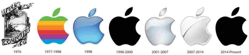
Apple logo design over the years
And the last tip: you can not check all brands or all logo books. And you may not have access to a logo attorney (but useful in some cases!), so at least do submit your creation to some online image search engine AND also to online trademark databases to see if, by “coincidence”, your new creation is similar nor identical to some already existing logo design!
사용된 용어집
Computer Aided Design (CAD): 엔지니어링, 건축, 제조 등 다양한 분야에서 설계를 생성, 수정, 분석 및 최적화하는 데 사용되는 소프트웨어 응용 프로그램으로, 디지털 도구와 기술을 통해 정밀한 도면과 모델을 만들 수 있습니다.
Computer-Aided Design (CAD): 엔지니어링, 건축, 제조 등 다양한 분야에서 설계를 생성, 수정, 분석 및 최적화하는 데 사용되는 소프트웨어 응용 프로그램으로, 디지털 도구와 기술을 통해 정밀한 도면과 모델을 만들 수 있습니다.
다룬 주제: 로고 디자인, 아이디어 구상, 제품 디자인, 인체공학, 창의적 프로세스, 현장 기록, 방법론, 상표, 심볼, 시각적 커뮤니케이션, 브랜딩, 타이포그래피, ISO 9001, ISO 9241, ISO 13407, ISO 27668, ISO 20252, ISO 25010.