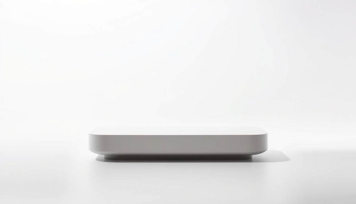
製品デザインにおける「Less Is More(少ないほど豊か)」という設計原則は、シンプルさと機能性を重視し、多くの場合、品質向上につながります。 ユーザーエクスペリエンス そして、生産コストの削減にもつながります。不要な機能を最小限に抑え、コア機能に重点を置くことで、デザイナーは使いやすくメンテナンスしやすい製品を生み出すことができます。合理化されたデザインは美観を高める傾向があり、部品点数が少なくなれば組み立て工程が簡素化されるため、製造上の欠陥が発生する可能性も低減します。このアプローチは、生産時の材料廃棄物やエネルギー消費量の削減につながるため、持続可能な取り組みとも合致することが多いのです。
主なポイント

- 製品デザインにおける「少ないほど豊か」という考え方では、複雑さよりもシンプルさが重視される。
- ミニマルなデザインは、ユーザーエクスペリエンスと満足度を高めます。
- 明瞭で整理されたインターフェースは 使いやすさ.
- 成功する製品は、余分な機能ではなく、必要不可欠な機能を優先することが多い。
- シンプルさは、しばしばブランド認知度の向上につながる。
右側の石版画をご覧ください。これはパブロ・ピカソが描いた有名な雄牛のスケッチです( ル・トーローのリトグラフの成功例 11 件(1945年)。私たちのほとんどは最初のバージョンを誇りに思っていたでしょうが、 彼は11ものバージョンを経て、最もシンプルなバージョンにたどり着いた。そこではどの行も重要であり、彼の雄牛を忘れられないものにしている。 シンプルなデザイン それは目標の一部であり、彼の才能の発揮でもあった。
わずか数行の描写で、雄牛は一目でそれとわかるように表現され、力強いメッセージを伝えるために、その視覚的な特徴(力強い肩、尻尾、立派な角、雄らしい特徴)がすべて盛り込まれている一方、重要度の低い細部は完全に消し去られている。
“ピカソは、私たち全員が始めたであろう場所で人生を終えた。
このピカソの例は、有名なリトグラフ印刷業者フェルナン・ムルローの著書『Gravés dans ma mémoire』(ロバート・ラフォン編、1979年)に掲載された優れた記事から引用したものです。
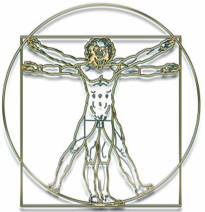
同じシンプルさの概念は、左側のレオナルド・ダ・ヴィンチの象徴的な作品にも強調されている。 ウィトルウィウス的人体図 5世紀前。
少ないほど良い
「少ないほど豊か」というデザイン哲学は、製品開発においてミニマルなアプローチを重視します。複雑すぎるとユーザーを混乱させ、結果として満足度を低下させると考えられています。デザイナーはシンプルさを追求し、アイデアの本質を保ちつつ、実用性も維持しようと努めます。
以下に説明するいくつかのデザインムーブメントは、このシンプルなアプローチを支持しています。それらは、ミニマリズムのアプローチが不要なものを排除することで、明確で魅力的なユーザー体験を生み出すのに役立つため、シンプルさがいかに使いやすさを向上させるかを示しています。
ミニマリストデザインを理解する: デザインにおけるミニマリズムとは、シンプルさを保ち、余分なものを削ぎ落とすことです。デザインのあらゆる要素に目的を持たせることで、ユーザーエクスペリエンスを向上させ、見た目も美しく保つことができます。
ミニマリストデザインの基本原則
ミニマリズムは見た目だけではなく、 明瞭さと機能性、そして 本当に重要なことに集中する。 主なポイントは以下のとおりです。
- すっきりとしたラインで、整然とした印象を与えます。
- 調和を生み出すために、いくつかの色を選ぶ。製品デザインでは、通常は1色、多くても2色(3色になるとリスクが高まります)。
- ユーザーとのやり取りをシンプルにする。
- デザインのあらゆる部分に明確な機能を持たせること。
- 空間を有効活用してレイアウトを改善する。
これらのアイデアは、ミニマリストデザインがテクノロジーと建築をどのように変革できるかを示しています。下のリビングルームの写真には、いくつの色がありますか?

デザインにおけるシンプルさの重要性
シンプルなデザインはすべてを明確にし、人々の製品利用を向上させます。デザイナーは物事をシンプルに保つために努力しています。不要なものを排除することで、誰もが重要なことに集中できるようにするのです。
“完璧とは、何も付け加えるものがなくなった時ではなく、何も取り除くものがなくなった時に達成される。“、アントワーヌ・ド・サン=テグジュペリ
- ユーザーにとって分かりやすく、集中できるデザイン:デザインが明確であれば、ユーザーは製品の機能をすぐに理解できます。シンプルなインターフェースは、難しい作業を簡単にします。これにより、誰もがより快適に作業できるようになります。直感的なデザインは、ユーザーがスムーズに次の作業へ移行できるようにし、あらゆる作業を高速化することで、ユーザーのストレスを軽減します。
- 使いやすさと安全性:シンプルなデザインは使いやすさに優れ、製品体験を向上させます。シンプルさを保つことで、製品は私たちの脳に過負荷をかけません。これは一流ブランドがよく理解していることです。
- Enhancing User Experience (UX) through clean and intuitive design: prioritizing simplicity in design enhances user experience. Designers aim for interfaces that users can easily navigate, easy to use in order to appeal to a wider audience. A product’s success often hinges on efficiently solving users’ problems.
| デザイン要素 | ユーザーエクスペリエンスへの影響 |
|---|---|
| シンプルさ | 認知負荷を軽減し、ユーザーが理解しやすく、操作しやすくします。 |
| ナビゲーション | ユーザーが製品をスムーズに使いこなせるようサポートし、全体的な満足度を高めます。 |
| フィードバック | ユーザーの操作に関する必要な情報を提供し、操作が成功したことを確認します。 |
| 視覚的階層構造 | 重要な要素に注意を向けさせ、使いやすさとエンゲージメントを向上させます。 |

トキポナ語でいうところのデザイン
トキポナ トキポナ(文字通り「良い言葉」「善の言語」)は、2001年にソニア・ラングによって考案された、シンプルさと良さを追求した完全な言語です。わずか120語程度の単語のみを用いてアイデアを表現するために作られた、ミニマルな人工言語です。このシンプルさによって、明瞭かつ簡潔なコミュニケーションが促進され、学習者は言語を素早く理解し、使いこなせるようになります。トキポナは複雑さを排除しているため、話者は本質的な概念に集中し、誤解を減らすことができます。限られた語彙で意味を伝えるための新しい方法を常に模索する必要があるため、トキポナを実践することで、マインドフルネスと創造性が促進されます。
わずか120語で全てを表現できるため、ポジティブな方法で要点を簡潔に伝えることが求められます。
これらの利点の中には、1か月でエスペラント語の基礎を、1日でトキポナ語を習得できるというものがあります。例: 「linja」は「line」、「hair」、「wire」を表します。 同様のアプローチを採用すれば、デザインプロジェクトの処理能力がどれほど向上するか想像してみてください!
形態は機能に従う
The concept of “form follows function” has its roots in the early 20th century in architecture., particularly associated with architects and designers like Louis Sullivan, who is often credited with coining the phrase, followed by Frank Lloyd Wright and other architects.
This principle suggests that the shape of a building or product should primarily relate to its intended function or purpose. In architectural design, it led to the development of structures that reflect their utility, such as skyscrapers that prioritize verticality to accommodate urban density. The movement gained momentum with the advent of modernism, which championed simplicity and functionality as key characteristics in the design of both buildings and objects.
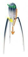
In smaller mechanical design, this concept would be related to 人間工学 and usability.
Some famous industrial designers have followed that with great success in the last 20 years. One of the iconic examples is the lean Juice Squizeer designed by Philippe Stack and produced by Alessi using the casting technique on the right:
All is about forms and functions in Stark’s lean design:
- The form on the top to shred the pulp
- The form in the middle to direct the juice to one central point, above the glass
- The three legs with angles to stay out of the juice and avoiding hyperstatism
- Not to mention the original shapes and ideas (rocket, ant, tree, nature …). Some may argue about the volume taken in the kitchen for storage; good products are likely more frequently used, stay in focus, and therefore not be stored.
“形態は機能に従う” can also be observed in various industries. Manufacturing practices more and more also align with this concept, as 積層造形 allowing the creation of complex geometries without unnecessary material waste. In aerospace, components are now often designed using topology optimization, resulting in parts that possess intricate shapes while achieving structural integrity and weight reduction.
See our detailed Forms Follows Function article and image library:


The K.I.S.S. Principle in Product Design
“Keep It Simple, Stupid.“
The KISS principle reminders designers in a memorable way to make better products focusing on simplicity, and effectiveness. Simple, intuitive products come from cutting out unnecessary parts.
“Complexity is your enemy. Any fool can make something complicated. It is hard to make something simple.” Sir Richard Branson
- simple to design; which means in less time on the market
- simplicity to build, assemble & control; frequently means cheaper
- simpler for your users to learn and use
- means also reliable & easy to maintain with standards parts and not too many specific tools or training
When more is just too much! Do not add additional spares. Remember these DIY assemble shelves: when you finished to assembled them, you are left with one or two additional screws or nuts? Were they provided as spares, or did you just forget them? Just don’t put them in the package, or be very clear on their purpose in the assembly instructions. As always, use with brain; fragile rare bulbs or easy-to-loose tiny screws can be an exception.

Jugaad to Design Simple

From the famous eponym book from Navi RADjou, Jaideep PRABHU, and Simone AHUJA, the Jugaad methodology, rooted in Indian innovation culture, is based on the idea of finding low-cost, resourceful solutions to problems by working with what is readily available. This approach values simplicity, adaptability, and quick thinking, often relying on creative improvisation instead of formal processes. By utilizing local resources and existing materials, Jugaad allows individuals and organizations to overcome constraints that may otherwise limit innovation.
The Jugaad approach is one of the root of the frugal innovation concept.

In product design, Jugaad encourages teams to create functional prototypes and solutions without waiting for perfect conditions or elaborate funding. Designers often repurpose everyday items or modify basic components to meet immediate user needs. This results in products that are accessible, affordable, and tailored to specific challenges. Through its practical and flexible methods, Jugaad often leads to unexpected innovations well-suited for environments with limited means.
This promotes not only simplicity in the design, but also (re)usage of already existing technologies or already developed products. A great book and a must-have in an innovation context.
Although not our preferred example of a successful シンプルなデザイン product, it is said that:
“One can repair a Kalashnikov with just a rubber band and a paper clip”

Why Complex Products Fail
Markets failures: many complex products in the market fail because they have too many features. This often overwhelms users. The failure of these products usually comes from not meeting customer expectations. Simplifying design to focus on user experience is essential.
Examples of overly complicated products: some consumer electronics have user interfaces that are hard to use. Remember the washing machines in the 80s with 50+ washing programs? While you were just using “White” or “Color” and dry or not at the end. Now arguments are simplicity first, offset time start, energy consumption, and sometimes noise level.
Technical failures: complex products often consist of numerous interconnected components and systems, each with specific functionalities and tolerances. This intricate design increases the likelihood of defects or failures due to various factors, including material variability, manufacturing inconsistencies, and assembly errors.
The interaction between these components can create unforeseen stress points, also leading to performance issues that may not be identified during the testing phase.
Rigorous market and V&V testing so as quality control measures are essential to mitigate these risks, yet the multifaceted nature of complex products inherently increases the potential for failure.
How many times was your latest hip-full-of-gadgets product out of service because of a secondary function that you don’t even use?
Do we really need cars with glasses opening some millimeters, just before closing the door to avoid the slight discomfort of over pressure? Just calculate the percentage time of usage in the product lifetime, versus potential failures inducted by the additional wearing of モーター and sealings.

Iconic Simple Designs
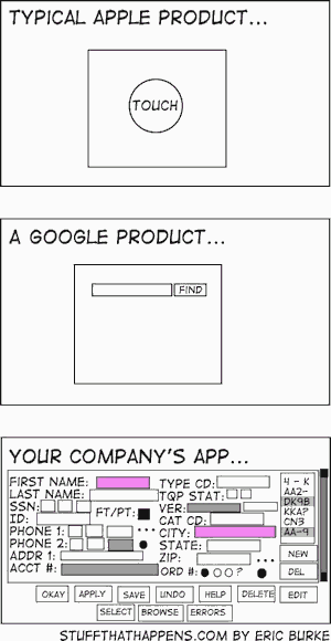
Looking at successful simple designs shows how minimalism can improve product design. Many brands show that simplicity can make the user experience better and strengthen brand identity. Apple is a key example in this area.
Apple’s Approach to Minimalist Product Design
Apple’s simple design philosophy plays a big part in its products’ success. Its devices are known for being easy to use with a sleek look, “Apple’s clean style”. Apple even uses this minimalist design in its marketing and packaging. This made the brand easy to recognize and remember.
Other big brands have also succeeded with simple designs. For example, Google and Spotify offer easy-to-use interfaces that make for a smooth user experience. Pringles stands out with its unique can design.
Balancing aesthetics and functionality in design: in the world of product design, there’s a big talk about looks vs. how things work. Making a product that’s both pretty and practical can make users happy and loyal. A good-looking product can grab attention, but it needs to work well, or people will lose interest. Designers have to focus on this balance. They need to make sure colors, shapes, and textures also help the product do its 仕事.
The main goal is to make products that wow people with their looks and work like a charm, ie putting looks and function on equal footing
| Brand | Design Feature | インパクト |
|---|---|---|
| Apple | Sleek interfaces with minimal distraction | Enhanced user experience and clarity |
| Simple search interface | Fast access to information | |
| Spotify | User-friendly music navigation | Increased user engagement |
| Pringles | Unique cylindrical packaging | Memorable branding and easy recognition |
アウトロ

Complementary to the Richard Branson intro quote, artists alike:
“Making the simple complicated is commonplace; making the complicated simple, awesomely simple, that’s creativity.” Charles Mingus
How many notes do you need to recognize Mile Davis ?


よくある質問
製品デザインにおける「Less Is More(少ないほど豊か)」とはどういう意味ですか?
「Less Is More(少ないほど豊か)」とは、製品デザインにおいてシンプルさを重視することを意味します。それは、機能性とユーザーエクスペリエンスを向上させるために不要なものを取り除くということです。シンプルさと機能性を重視し、ミニマリスト的なアプローチがユーザーエクスペリエンスと製品効率を高めることができると主張します。この原則は、デザイナーやエンジニアに対し、不要な要素を排除し、複雑さでユーザーを圧倒することなく、ユーザーのニーズを満たすコア機能に焦点を当てるよう促します。
ミニマルデザインは、ユーザーエクスペリエンスをどのように向上させるのか?
ミニマリストデザインは、すっきりとしたシンプルなインターフェースを提供することで、ユーザーにとって使いやすくします。余計な機能がなく、理解しやすく、操作も簡単です。ミニマリストデザインは、シンプルさと機能性を優先することでユーザーエクスペリエンスを向上させ、操作を効率化し、認知負荷を軽減します。主な原則としては、不要な要素の排除、限られた色数の使用、ユーザーのニーズに直接応える重要な機能への集中などが挙げられます。
複雑な製品は、なぜしばしばユーザーのニーズを満たせないのでしょうか?
複雑な製品は、設計および開発プロセスに関連するさまざまな要因により、ユーザーのニーズを満たせないことが少なくありません。複雑度が高いと、複雑な機能がユーザーの期待する主要機能から注意をそらしてしまうため、ユーザー要件の誤解につながる可能性があります。開発段階でのユーザーテストが不十分だと、実際のユーザーの行動や好みに合わない製品になってしまうことがあります。さらに、設計、エンジニアリング、マーケティングなどの部門横断的なチーム間のコミュニケーション不足は、ユーザーからのフィードバックを最終製品に反映させることを妨げる可能性があります。
ユーザーからのフィードバックは、製品設計の簡素化にどのような役割を果たすのでしょうか?
ユーザーからのフィードバックは、デザイナーが何がうまくいき、何がうまくいかないかを把握し、ユーザビリティを向上させるのに役立ちます。これは、問題点や改善点を特定することで、製品デザインを洗練させるための重要な情報となります。フィードバックを体系的に収集することで、デザイナーとエンジニアは、ユーザー操作を複雑にする可能性のある特定の機能を特定し、機能性を合理化する反復的な修正につなげることができます。
KISS原則とは何ですか?また、なぜ重要なのでしょうか?
KISS原則とは「Keep It Simple, Stupid(シンプルに保て、バカ)」の略です。この原則は、製品の理解と使用を容易にするためにシンプルさを追求するものであり、非常に重要です。システムやデザインは、複雑さを最小限に抑えつつ、機能性と使いやすさを最大限に高めるために、可能な限りシンプルであるべきだと提唱しています。この原則は、潜在的なエラーを減らし、生産コストを削減し、ユーザーエクスペリエンスを向上させるため、製品の設計と製造において重要です。
プロダクトデザイナーは、シンプルさと機能性のバランスをどのように取るのか?
企業は、本当に重要な機能を慎重に選択することでバランスを見つけます。ユーザーのニーズを満たすこと、そして追加されるすべての機能が真に価値のあるものであることを確認することに重点を置いています。これには、反復的なプロトタイピングとユーザーテストが含まれており、不必要な複雑さを最小限に抑えながら、必須の機能を維持するようにしています。デザイナーは、ミニマリズムや intuitive interface 操作を効率化し、ユーザーの認知負荷を効果的に軽減するよう設計する。
補足資料
- ユーザー中心 Design (UCD): エンドユーザーのニーズと好みに焦点を当て、直感的に操作できる製品を開発する。
- 最小実行可能製品 (MVP): 初期ユーザーを満足させ、今後の改良のためのフィードバックを収集するのに十分な機能を備えた製品を開発する。
- モジュール設計: 組み立て、メンテナンス、アップグレードを簡素化する、互換性のある部品を使用した製品を開発する。
- 人間工学: 快適性と使いやすさを向上させ、よりシンプルなユーザーエクスペリエンスに貢献するために、人間工学に基づいた製品設計を行う。
- システム思考: 製品のさまざまな構成要素がより大きなシステム内でどのように相互作用するかを理解することで、複雑さを簡素化する
- A/Bテスト: ユーザーからのフィードバックに基づいて、さまざまな設計案を評価し、最もシンプルで効果的な解決策を特定する。
- デザイン思考: 複雑な課題を簡素化するために、共感、アイデア創出、プロトタイピングを重視する問題解決アプローチ。
- 機能分析: 製品の機能を評価し、不要な機能を特定して排除することで、中核となる機能に重点を置くようにします。
- 視覚的な階層構造: 情報提示を優先する設計原則を活用することで、製品の操作性と使いやすさを向上させる。
用語集
Minimum Viable Product (MVP): 初期ユーザーのニーズを満たし、今後の開発のためのフィードバックを収集するために必要な基本機能のみを搭載した製品の基本バージョン。最小限のリソースと時間投資で顧客ニーズに関する仮説を検証することを目的としている。
User experience (UX): the overall satisfaction and perception of a user when interacting with a product, system, or service, encompassing usability, accessibility, design, and emotional response throughout the entire interaction process.
User Interface (UI): a system that enables interaction between users and software applications, encompassing visual elements, controls, and overall layout to facilitate user tasks and enhance experience.