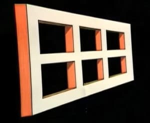
エイムズの窓とエイムズの部屋の錯覚
エイムズの窓は、1940年代にアメリカの科学者アデルバート・エイムズ・ジュニアによって考案された古典的な錯視である。
 Visual design decides what the eye finds first. Contrast, size, alignment, color and proximity establish a hierarchy, and a clear hierarchy lets a user act without reading everything.
Color carries meaning by convention. The article on color coding in product design lists three benefits and the usual meanings. The standards framework for graphical symbols and color coding gives the normative basis, the reason a warning sign reads the same on machines from different makers.
Applications follow. GUI design fundamentals deal with screens, packaging design with shelves, and the world visualizer with choropleth maps, where a poor color scale can distort the message. The Ames window and room demonstrate how visual cues mislead. For behaviour over time, see インタラクションデザイン. For brand aspects, ブランディング戦略.
エイムズの窓は、1940年代にアメリカの科学者アデルバート・エイムズ・ジュニアによって考案された古典的な錯視である。

今日のニュースを笑顔で見てみよう:買い物客は通常、商品を購入するかどうかを決める前に、ほんのわずかな時間だけその商品を評価するだけだ。

本日のニュースに関する私たちの見解:あるDIYプロジェクトでは、特注の……を使って、本を壁掛けのアート作品として飾る方法が紹介されています。
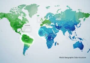
This free innovation.world choropleth world map tool permits to visualize and compare any country-by-country data directly in your browser. With

Colors and graphical symbols are often used to convey specific types of information across various contexts, in a fast and

1990年代、ニールセンとモリッヒは10のユーザー・インターフェース・ガイドラインを作成した。これらのガイドラインは、私たちがグラフィック
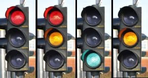
色分けは、情報を迅速かつ効果的に伝える手段として、何世紀にもわたって利用されてきました。歴史的に見ると、古代文明では

Good shelve positioning is key for selling in supermarkets where competition is tough. Here can designers come into play for