Décrire un modèle général de la manière dont les lecteurs occidentaux parcourent une page conventionnelle d'informations textuelles réparties de manière uniforme. Il suggère un parcours allant du haut de la page à gauche au bas de la page à droite.
- Méthodologies : Ingénierie, Qualité
Diagramme de Gutenberg
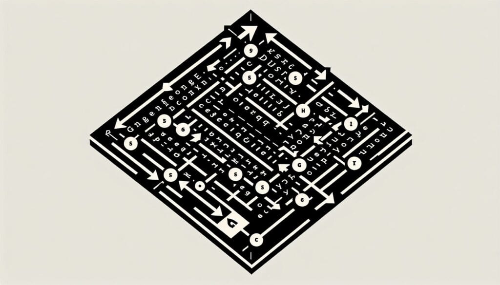
Diagramme de Gutenberg
- Principes de conception, Processus de conception, Pensée conceptuelle, Conception centrée sur l'humain, Architecture de l'information, Utilisabilité, Expérience utilisateur (UX), Interface utilisateur (UI), Conception visuelle
Objectif :
Comment il est utilisé :
- Les concepteurs placent des éléments clés le long de ce chemin de lecture naturel (zone optique primaire en haut à gauche, zone de jachère forte en haut à droite, zone de jachère faible en bas à gauche et zone terminale en bas à droite) afin de s'assurer que les informations importantes sont remarquées.
Avantages
- Fournit une ligne directrice simple pour l'emplacement des éléments sur une page pour les mises en page conventionnelles à forte teneur en texte, aide à hiérarchiser l'affichage des informations, peut améliorer la lisibilité et l'absorption des informations pour certains types de contenu.
Inconvénients
- Moins applicable aux mises en page riches en images ou non conventionnelles, basée sur les habitudes de lecture occidentales et ne s'appliquant pas universellement, peut conduire à des conceptions prévisibles ou peu créatives si elle est suivie de manière trop rigide, la conception moderne des sites web utilise souvent des modèles de balayage plus complexes (par exemple, le modèle F, le modèle Z).
Catégories :
- Clients et marketing, Ergonomie, Conception de Produits
Idéal pour :
- Concevoir des mises en page pour des contenus à forte densité de texte et à distribution uniforme (livres, articles, pages web traditionnelles) afin d'optimiser la lisibilité et les schémas de balayage de l'utilisateur.
Le diagramme de Gutenberg est particulièrement efficace dans les domaines de la conception graphique, de la publicité et du développement web, où la clarté et la compréhension immédiate sont primordiales. Cette méthodologie est couramment appliquée lors des phases d'idéation et de mise en page de projets impliquant des brochures, des rapports annuels, des pages d'atterrissage ou tout autre support riche en contenu, permettant aux concepteurs de présenter les informations de manière digeste. Par exemple, dans la mise en page d'un magazine, l'utilisation de la zone supérieure gauche pour des titres captivants associés à des images permet d'attirer immédiatement l'attention, tandis que l'utilisation de textes complémentaires dans les sections inférieures permet de maintenir l'intérêt du lecteur sans le submerger. Les secteurs tels que l'édition, l'éducation et le marketing bénéficient souvent de ce modèle, car il permet aux créateurs de donner la priorité aux éléments qui favorisent l'interaction et la compréhension de l'utilisateur. L'initiateur de cette méthodologie peut aller des concepteurs UX/UI aux équipes de marketing, qui collaborent avec les stratèges de contenu pour aligner la hiérarchie visuelle sur les objectifs de messagerie. Les participants comprennent des rédacteurs qui fournissent le texte, des concepteurs graphiques qui arrangent les visuels, et même des chercheurs en expérience utilisateur qui peuvent tester diverses mises en page par rapport aux comportements des utilisateurs pour affiner l'efficacité. Ce diagramme peut guider ceux qui cherchent à améliorer l'expérience des utilisateurs sur diverses plateformes, en veillant à ce que les éléments essentiels soient placés là où les utilisateurs regardent naturellement en premier, améliorant ainsi la probabilité que les messages clés soient communiqués efficacement.
Principales étapes de cette méthodologie
- Identifier la zone optique primaire pour le contenu le plus important.
- Positionner les éléments clés dans la partie supérieure gauche pour une visibilité immédiate.
- Utilisez la zone en jachère en haut à droite pour les informations complémentaires.
- Réservez la faible zone en jachère en bas à gauche pour des contenus moins critiques.
- Placez des éléments d'appel à l'action ou des informations de conclusion dans la zone terminale en bas à droite.
- Veillez à ce que la disposition soit équilibrée et tienne compte du flux naturel de la lecture.
- Tester la mise en page avec des utilisateurs réels pour évaluer la compréhension et l'efficacité de la navigation.
Conseils de pro
- Utiliser la hiérarchie visuelle : Établir une distinction claire entre les titres, les sous-titres et le corps du texte pour guider l'attention de l'utilisateur dans le diagramme de Gutenberg.
- Incorporez des espaces blancs de manière stratégique : Utilisez l'espace autour des éléments clés pour éviter le désordre et permettre aux utilisateurs d'assimiler plus facilement les informations dans des présentations denses.
- Aligner les contenus connexes : Placez les informations complémentaires à proximité des éléments principaux de la zone optique primaire afin d'améliorer la compréhension du contexte et de renforcer les messages principaux.
Lire et comparer plusieurs méthodologies, nous recommandons le
> Référentiel méthodologique étendu <
ainsi que plus de 400 autres méthodologies.
Vos commentaires sur cette méthodologie ou des informations supplémentaires sont les bienvenus sur le site web de la Commission européenne. section des commentaires ci-dessous ↓ , ainsi que toute idée ou lien en rapport avec l'ingénierie.
Contexte historique
1986
(si la date est inconnue ou n'est pas pertinente, par exemple "mécanique des fluides", une estimation arrondie de son émergence notable est fournie)
Articles Similaires
Gestion des opérations de fabrication (MOM)
Système d'exécution de la fabrication (MES)
Plan de contrôle de la fabrication
Tests manuels
Tableaux d'évaluation des manutentions manuelles (MAC)
ManTRA (outil d'évaluation des risques liés aux tâches manuelles)