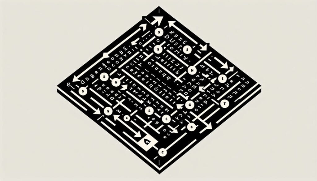
To describe a general pattern of how Western readers scan a conventionally designed page of evenly distributed, text-based information. It suggests a path from top-left to bottom-right.
- Metodologie: Ingegneria, Qualità
Gutenberg Diagram
Gutenberg Diagram
- Principi di progettazione, Processo di progettazione, Pensiero progettuale, Human-Centered Design, Architettura dell'informazione, Usabilità, Esperienza utente (UX), Interfaccia utente (UI), Design visivo
Obiettivo:
Come si usa:
- Designers place key elements along this natural reading path (primary optical area in top-left, strong fallow area in top-right, weak fallow area in bottom-left, and terminal area in bottom-right) to ensure important information is noticed.
Professionisti
- Provides a simple guideline for placing elements on a page for conventional text-heavy layouts, helps prioritize information display, can improve readability and information absorption for certain types of content.
Contro
- Less applicable to image-heavy or unconventional layouts, based on Western reading habits and may not apply universally, can lead to predictable or uncreative designs if followed too rigidly, modern web design often uses more complex scanning patterns (e.g., F-pattern, Z-pattern).
Categorie:
- Clienti e marketing, Ergonomia, Progettazione del prodotto
Ideale per:
- Designing layouts for text-heavy, uniformly distributed content (like books, articles, traditional web pages) to optimize readability and user scanning patterns.
The Gutenberg Diagram is particularly effective in the realms of graphic design, advertising, and web development where clarity and immediate comprehension are paramount. This methodology is commonly applied during the ideation and layout phases of projects involving brochures, annual reports, landing pages, or any content-rich media, enabling designers to present information in a digestible manner. For instance, in developing a magazine layout, using the top-left area for captivating headlines paired with images can draw immediate attention, while ensuring supporting text occupies the lower sections can maintain reader engagement without overwhelming them. Industries such as publishing, education, and marketing often benefit from this model, as it allows creators to prioritize elements that drive user interaction and understanding. The initiator of this methodology can range from UX/UI designers to marketing teams, who collaborate with content strategists to align visual hierarchy with messaging goals. Participants include copywriters who provide text, graphic designers who arrange visuals, and even user experience researchers who may test various layouts against user behaviors to refine effectiveness. This diagram can guide those looking to enhance user experience across various platforms, ensuring that essential elements are positioned where users naturally look first, improving the likelihood that key messages are communicated effectively.
Fasi chiave di questa metodologia
- Identify the primary optical area for the most important content.
- Position key elements in the top-left area for immediate visibility.
- Utilize the strong fallow area in the top-right for supporting information.
- Reserve the weak fallow area in the bottom-left for less critical content.
- Place call-to-action items or concluding information in the terminal area at the bottom-right.
- Ensure a balanced layout considering the natural flow of reading.
- Test the layout with real users to assess comprehension and navigation efficiency.
Suggerimenti per i professionisti
- Utilize visual hierarchy: Establish a clear distinction between headings, subheadings, and body text to guide user attention through the Gutenberg Diagram.
- Incorporate whitespace strategically: Use space around key elements to prevent clutter and allow users to digest information more easily in dense layouts.
- Align related content: Position supporting information near main elements in the primary optical area to enhance contextual understanding and reinforce primary messages.
Leggere e confrontare diverse metodologie, raccomandiamo il
> Ampio archivio di metodologie <
insieme ad altre 400 metodologie.
I vostri commenti su questa metodologia o ulteriori informazioni sono benvenuti su sezione commenti qui sotto ↓ , così come tutte le idee o i link relativi all'ingegneria.
Contesto storico

1986
(se la data non è nota o non è rilevante, ad esempio "meccanica dei fluidi", viene fornita una stima approssimativa della sua notevole comparsa)
Post correlati
Simulazione di Monte Carlo
Test basati su modelli
Controllo del modello
Ricerca con metodi misti
A prova di errore (Poka-Yoke)
Test del profilo di missione