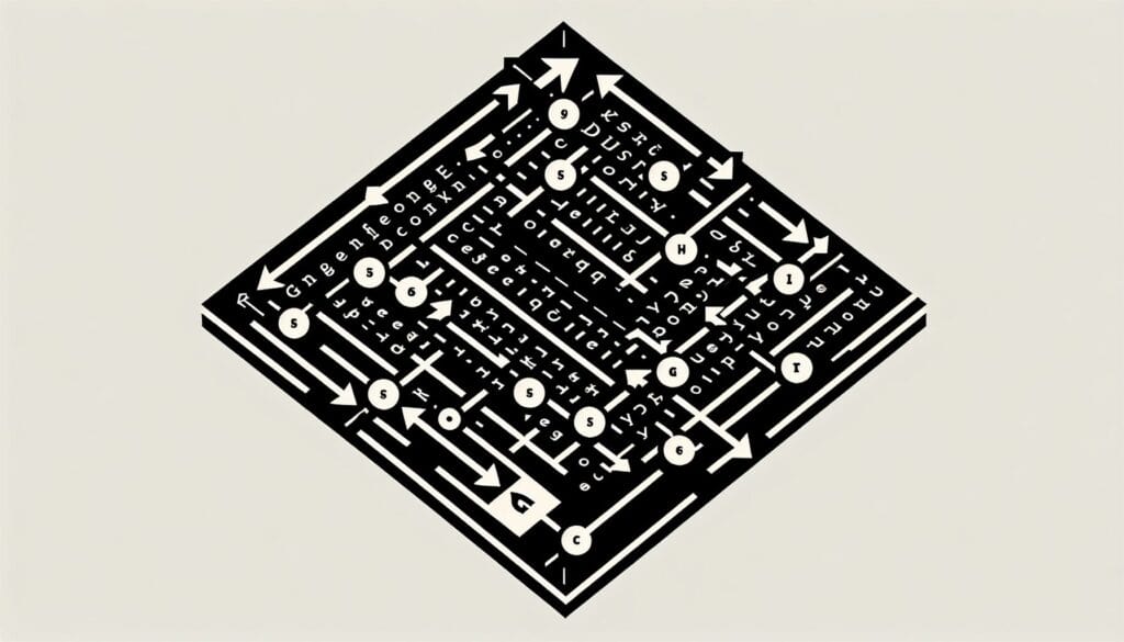
To describe a general pattern of how Western readers scan a conventionally designed page of evenly distributed, text-based information. It suggests a path from top-left to bottom-right.
- 方法: 工程, 质量
Gutenberg Diagram
Gutenberg Diagram
- 设计原则, 设计过程, 设计思维, Human-Centered Design, 信息架构, 可用性, 用户体验(UX), 用户界面(UI), 视觉设计
目标
如何使用
- Designers place key elements along this natural reading path (primary optical area in top-left, strong fallow area in top-right, weak fallow area in bottom-left, and terminal area in bottom-right) to ensure important information is noticed.
优点
- Provides a simple guideline for placing elements on a page for conventional text-heavy layouts, helps prioritize information display, can improve readability and information absorption for certain types of content.
缺点
- Less applicable to image-heavy or unconventional layouts, based on Western reading habits and may not apply universally, can lead to predictable or uncreative designs if followed too rigidly, modern web design often uses more complex scanning patterns (e.g., F-pattern, Z-pattern).
类别
- 客户与营销, 人体工程学, 产品设计
最适合:
- Designing layouts for text-heavy, uniformly distributed content (like books, articles, traditional web pages) to optimize readability and user scanning patterns.
The Gutenberg Diagram is particularly effective in the realms of graphic design, advertising, and web development where clarity and immediate comprehension are paramount. This methodology is commonly applied during the ideation and layout phases of projects involving brochures, annual reports, landing pages, or any content-rich media, enabling designers to present information in a digestible manner. For instance, in developing a magazine layout, using the top-left area for captivating headlines paired with images can draw immediate attention, while ensuring supporting text occupies the lower sections can maintain reader engagement without overwhelming them. Industries such as publishing, education, and marketing often benefit from this model, as it allows creators to prioritize elements that drive user interaction and understanding. The initiator of this methodology can range from UX/UI designers to marketing teams, who collaborate with content strategists to align visual hierarchy with messaging goals. Participants include copywriters who provide text, graphic designers who arrange visuals, and even user experience researchers who may test various layouts against user behaviors to refine effectiveness. This diagram can guide those looking to enhance user experience across various platforms, ensuring that essential elements are positioned where users naturally look first, improving the likelihood that key messages are communicated effectively.
该方法的关键步骤
- Identify the primary optical area for the most important content.
- Position key elements in the top-left area for immediate visibility.
- Utilize the strong fallow area in the top-right for supporting information.
- Reserve the weak fallow area in the bottom-left for less critical content.
- Place call-to-action items or concluding information in the terminal area at the bottom-right.
- Ensure a balanced layout considering the natural flow of reading.
- Test the layout with real users to assess comprehension and navigation efficiency.
专业提示
- Utilize visual hierarchy: Establish a clear distinction between headings, subheadings, and body text to guide user attention through the Gutenberg Diagram.
- Incorporate whitespace strategically: Use space around key elements to prevent clutter and allow users to digest information more easily in dense layouts.
- Align related content: Position supporting information near main elements in the primary optical area to enhance contextual understanding and reinforce primary messages.
历史背景
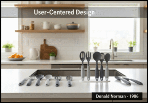
1986
(如果日期不详或不相关,例如 "流体力学",则对其显著出现的时间作了四舍五入的估计)。
相关文章
METS 卡路里计算器
元分析
信息映射
心理模型图
可接受的最大推力和拉力
物料需求计划(MRP)