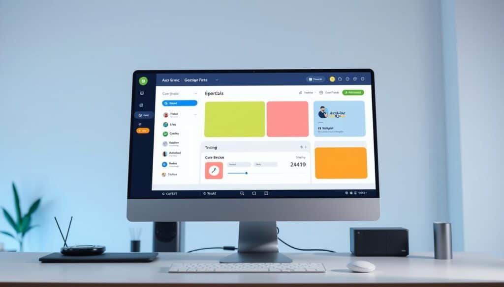
In the 1990s, Nielsen and Molich created 10 user interface guidelines. These guidelines are key in how we design graphic user interfaces today. They help us make interfaces that are easy to use and understand, improving how users interact with digital platforms. A good user interface combines beauty with practicality, making it simple for people to use software or apps.
Principaux enseignements
- Nielsen and Molich’s guidelines are still relevant in modern graphic user interface design, guiding designers towards more intuitive interfaces.
- Incorporating these established principles can enhance usability, utility, and desirability in software applications.
- User interface design should focus on minimizing user effort and maximizing satisfaction.
- Consistency and familiarity in layout and terminology help users acclimate quickly to new interfaces.
- Effective feedback mechanisms and error prevention are crucial in creating a smooth expérience utilisateur.
Introduction to GUI Design
In the tech world, GUI design matters a lot for creating useful and good-looking apps. Knowing the basic principles helps designers make interfaces that improve user experiences. This support also builds brand loyalty.
What is GUI Design?
GUI design means working on the visual parts of a user interface. Designers create elements like menus and buttons that are straightforward and simple to use. The Apple Macintosh, which brought icons and mouse clicks, set the standard high.
The Importance of Intuitive Interfaces
Intuitive interfaces make it easier for users to do tasks. They also play a big role in a product’s and company’s success. Take the Xerox Star: it was first with a GUI but failed in the market. But Steve Jobs took inspiration from it for the Apple Lisa and Macintosh, which were hits. Note how the Windows’95 GUI, despite its complaints, stressed the need for smart design.
It’s also key to understand concepts like affordance. Affordance means something looks usable, while false affordance leads users astray. Nielsen and Molich’s guidelines stress lessening mental strain and keeping things consistent. This makes interfaces easy to get used to.
Following these design rules helps make applications focused on the user. They not only work better but also make users happier and more loyal. The goal, no matter the system, is smooth interaction and a great experience for the user.
Key Principles of GUI Design
Creating user-friendly digital products starts with good Graphical User Interface (GUI) design. This involves providing intuitive and engaging visual interfaces. It focuses on making the user’s experience better.
Simplicity
Simplicity in GUI design means keeping everything straightforward. This makes for smooth user interactions. Interfaces are easy to use when they’re not cluttered. Designers aim for this simplicity. It helps users explore without feeling overwhelmed.
Garder design simple boosts user satisfaction. This is true for both websites and apps. Simplicity ensures users enjoy their time on the digital platform.
Consistency
Consistency matters a lot in GUI design. It’s about keeping things uniform. This includes color schemes, typography, and icons. When these elements are consistent, users feel more at ease. This helps them navigate better.
Good design maintains this consistency everywhere. This should be the case in both web and app design. It’s how you keep users happy and less frustrated.
Commentaires
Feedback is a key part of GUI design. It lets users know the results of their actions. This could be through visuals, sounds, or vibrations. Good feedback helps users feel in control.
It builds trust by creating intuitive experiences. Users need this to navigate confidently.
Hierarchy
Hierarchy guides users to what’s important. It uses size, color, and placement for emphasis. This makes it easier for users to understand and act.
Having a strong visual hierarchy is essential. It allows users to quickly get information and decide.
User-Centered Design Approach
Le site user-centered design approach focuses on users’ needs and expectations. It puts them at the center of the design process. Through research, user personas, and user flows, products fit their intended users well.

User Research
Comprehensive user research kicks off effective user-centered design. Teams collect data through surveys, interviews, and social media. These methods uncover user experiences and perceptions. Direct engagement offers deep insights into users’ behaviors and needs. It’s crucial for designs that meet real-world needs.
User Personas
User personas are key in user-centered design. They’re fictional but based on real user data. Personas keep design focused on important user groups. They incorporate details like age and goals to tailor designs. This ensures the design is usable and meets various user needs.
User Flows
Mapping user flows outlines users’ paths through a design. It visualizes the journey, aiming for smooth and intuitive interactions.
By predicting user paths, designers can remove hurdles.
This leads to a better user journey. Detailed user flows highlight areas to boost engagement. They make interactive designs more satisfying and efficient.
A user-centered design approach improves GUI usability, satisfaction, and engagement. By prioritizing real user needs and involving them, products are both functional and impactful.
Visual Hierarchy in GUI Design
Visual hierarchy directs users’ focus to key areas by organizing elements wisely. By using size, color, and placement, it improves GUI ergonomics. Since our eyes spot visuals first, a well-structured design is critical for user interfaces.
- Size: Bigger elements grab more notice, showing what’s important.
- Color: Vivid colors pop out and show the brand’s heart, drawing eyes.
- Alignment: Lined-up items create a neat visual flow, guiding the viewer.
- Repetition: Repeating designs makes things familiar and points to linked info.
- Proximity: Items close to each other seem related, making content clear.
- Whitespace: Space around stuff makes it easier to read and highlights areas.
- Texture & Style: Textures draw the eye to key spots and evoke feelings, adding layers to the UI.
Here are common layout patterns:
- Z Pattern: Great for sites with little text, eyes move from top-left to bottom-right.
- F Pattern: Works well for sites with lots of content, eyes sweep left to right, then down on the left side.
Getting these concepts right helps in making visual design work better. This, in return, boosts GUI ergonomics. In the end, it leads to interfaces that are easy and pleasant to use.
| Facteur | Impact on Visual Hierarchy |
|---|---|
| Size | Bigger elements stand out |
| Color | Bright colors catch the eye, show brand vibe |
| Alignment | Makes a clean visual order |
| Repetition | Brings comfort, signals related things |
| Proximity | Tells which elements are together |
| Whitespace | Makes content readable, highlights parts |
| Texture & Style | Emphasizes key areas, adds depth |
Effective Use of Whitespace
In GUI design, using whitespace wisely can totally change how users interact. This simple design method keeps the user interface clean. It makes the user experience more fun and efficient.

Creating Focus
Whitespace, known as negative space, directs user attention to key parts. Studies show that smart whitespace use can make text 20% easier to read. It does this by using padding and margins to show what’s most important.
Whitespace makes things look grouped if they are close. This is the law of proximity. Apple uses whitespace well to spotlight product features, creating a luxury feel. Whitespace around important elements can boost conversions by 30%. This shows its power in focusing user attention.
Avoiding Clutter
A clean interface, made with minimalist design, improves cleanliness. Research by the Nielsen Norman Group (NNG) says whitespace guides eyes and organizes content. Too much clutter makes people frustrated and distracted from the main message.
A grid system, used by 70% of UI designs for whitespace, keeps things orderly. Managing whitespace well keeps content organized and flowing, especially on long-scroll websites. Websites using whitespace well see a 40% jump in user engagement. Less really is more.
For mobile apps, whitespace is key too. Apps that are clean and not cluttered get a 25% higher user retention. This shows the importance of whitespace in making things easy to read and reducing clutter. This keeps the user experience positive.
| Avantages | Statistics |
|---|---|
| Increased Readability | 20% improvement (Wichita State University) |
| Higher User Engagement | 40% increase |
| Increased User Retention (Mobile Apps) | 25% improvement |
| Higher Conversion Rates | 30% increase |
| Improved Trust and Professionalism | 65% of users’ perception |
Focus on whitespace boosts user interface cleanliness and user satisfaction. The right balance of content and whitespace makes a GUI that feels right to users. It matches well with their needs.
Consistency and Standardization
Adhering to consistent design principles helps users trust and enjoy the platform more.
Consistent Layouts
Maintaining consistent layouts helps users navigate easily. Things like consistent typography, colors, and buttons are crucial. By using reusable UI elements, platforms like Adobe Photoshop and Gmail offer a familiar experience that users appreciate.
Standardized Navigation Menus
Navigation menus guide users through a website or app. Using standardized elements makes functionality clear. For example, Gmail uses consistent labels, making it easy to use.
| Design Element | Consistency Benefit | Exemple |
|---|---|---|
| Typography | Improves readability and design quality | Gmail’s consistent typographic style for headers and body text |
| Color Palette | Establishes strong brand identity | Adobe Photoshop’s well-defined color schemes |
| Buttons and Icons | Enhances user recognition and understanding | Reusable UI components in applications like React projects |
| Navigation Bars | Creates seamless user experience | YouTube’s consistent video player design |
Importance of Feedback Mechanisms
Feedback mechanisms are critical in the design of graphical user interfaces (GUIs). They ensure users get quick responses to their actions. This creates a smooth interaction experience.

Designs that meet user expectations boost satisfaction, loyalty, and engagement.
Yet, dealing with lots of feedback can be tough. It may involve hundreds or thousands of comments. User segmentation, A/B testing, and interviews help deal with mixed feedback. It’s also crucial to check if the feedback is relevant through profiling and analysis.
| Mechanism | Bénéfice | Exemple |
|---|---|---|
| Pre-loaders | Reduces abandonment rates | Spinning wheels, animations |
| In-app Prompts | Increases user engagement | Tooltips, action messages |
| Progress Bars | Encourages task completion | Signup, onboarding flows |
| Contextual Feedback | Enhances user guidance | Error messages, button color changes |
| Visual Feedback | Improves interactive elements | Button animations, notifications |
Good feedback mechanisms include changing button looks during use, instant messages for forms, and loading signs and respect these rules:
- clear messages for success or errors
- Adding physical responses, with other senses, like vibrations on phones, is helpful too.
- should be given right after a user does something to avoid confusion
- Using the same feedback patterns helps users
Testing these mechanisms with users and updating them based on observations is key. It ensures they meet user needs well.
Accessibility in GUI Design
Making GUI design accessible is not only about following the law. It also makes sure applications and websites work well for people with different abilities. Designers who focus on making their work inclusive create welcoming interfaces. This lets more people use their products.

Color Contrast
It’s very important to have good color contrast for everyone, especially people with visual impairments. The WCAG says text and background need a contrast ratio of at least 4.5:1. This rule helps people with low vision read better and meets Level AA standards.
Different levels of accessibility show how well a design meets these standards:
- Level A (Priority 1): Covers basic accessibility – the least needed for compliance.
- Level AA (Priority 2): This is often the legal minimum in places like the US and Canada.
- Level AAA (Priority 3): The top standard for accessibility.
In places like Toronto, laws require even tougher standards with Level AA. This makes sure websites can be used by more people.
Screen Reader Compatibility
Working with screen readers is a key part of making GUIs accessible and inclusive. The WCAG has rules to make sure headings, labels, and the order of content make sense to screen reader users. These rules help keep the content’s meaning clear.
When making a website work well with screen readers, remember to:
- Use clear labels for forms and controls.
- Keep content in a logical order.
- Give non-text elements descriptive alt text.
Following these tips helps people using screen readers to navigate and understand the interface easier.
| Accessibility Level | Requirements | Exemples |
|---|---|---|
| Level A (Priority 1) | Basic features for the least compliance. | Alt text for images, content in a meaningful order. |
| Level AA (Priority 2) | Minimum legal standard in the US and Canada. | Color contrast ratio of 4.5:1, clear headings. |
| Level AAA (Priority 3) | The highest accessibility level. | Better contrast ratios, more alt text, logical content structure. |
Using these guidelines helps make interfaces that are easier to use for everyone. This benefits both users and companies.

Testing and Iteration in GUI Design
Good GUI design needs constant testing and updates. This makes sure the interface works well for users. It keeps usability high.
Usability Testing
Usability testing focuses on the user’s experience. Designers watch users use the interface to find problems. Usability can jump by 200% after just a couple of tries tries.
They look at how happy users are, how much they engage, and conversion rates. But, small test groups or ignoring feedback can mess up testing.
A/B Testing
A/B testing compares two design options. It shows which design users like more. This helps make better design choices.
Testing your design against others gives insight into user actions. Always remember ethics like transparency and privacy.
Text, Image, and Video in GUI
Combining text, images, and videos in GUIs makes them more fun and interactive. This blend makes interfaces not just good-looking but dynamic too.
Now, showing content well in GUIs is key. Take Apple’s iOS and Google’s Android for example. They use text, images, and videos for a cool experience. Their designs let us use simple gestures for better interaction.
“The mix of text, images, and videos in GUIs changes how we interact with gadgets. It’s way more fun and easy than old-school commands.”
Special GUIs like in ATMs or kiosks also benefit. They use text and images to talk clearly and quickly. For cars, video helps with live directions and maps.
| Application | Exemple | Key Usage |
|---|---|---|
| Banking | ATM Screens | Text and Icon Navigation |
| Retail | POS Systems | Image-based Touch Menus |
| Automobile | Multimedia Displays | Video for Real-Time Navigation |
Aesthetics vs. Functionality
While good looks attract users, focusing only on beauty can frustrate them if it’s not useful. The best design combines these elements, making apps engaging and easy to use.
Balancing Visual Appeal and Usability
Creating a balanced interface needs a mix of good looks and usability. If an app looks good but works poorly, people won’t use it for long.
By mixing functional design et aesthetic interfaces, GUI becomes attractive and practical.
The balance is crucial for several reasons:
- User research helps understand needs, improving looks and function.
- Information architecture makes navigation clearer, aiding function.
- Sketches and prototypes emphasize usability before adding visual touches.
- User testing checks if the app meets expectations in both looks and function.
Prioritizing Function
Though good looks are important for branding, function keeps users coming back. Some banking apps or mail apps may not look great but work so well, people keep using them. This shows how vital functional design is for keeping users happy.
Below is a table showing key points of function and aesthetics:
| Aspect | Détails |
|---|---|
| Fonctionnalité | Ensures efficiency, reliability, and usability. It’s key for staying engaged. |
| Aesthetic | Draws users in with beauty, making a strong first impression. |
| Balance | Mixing both elements is vital for the best experience. |
To sum up, effective GUI design needs a careful balance of functional design et aesthetic interfaces. This blend not only grabs attention but also makes apps useful and friendly to users.
Handling Microinteractions
Microinteractions are key in today’s GUI design. They make the user experience better by responding quickly to what users do. These include things like scrollbars and swipe animations. They help make everything run smoothly by reacting to users’ actions.
Button Animations
Button animations are important interactive elements. They give feedback right when a user clicks, making the experience feel alive. This feedback might be a color change or a bounce effect. These details guide users, showing them they’re doing things right and helping them move around easily.
Progress Indicators
Progress indicators can also make a big difference. They show how far along a task is, keeping users in the loop. An example is LinkedIn’s pull-to-refresh action, shown with a circular indicator. This keeps users informed and adds to the feeling of achievement as they see progress.
Microinteractions, like button animations and progress indicators, make user experiences better. By adding these, designers can make websites and apps more engaging and easier to use. This leads to happier users who enjoy interacting with the interface.
Common Mistakes in GUI Design
Designing a good Graphical User Interface (GUI) needs lots of thought. We must avoid common design pitfalls. It’s important to create a user experience that feels good by not making GUI errors.
Overloading with Information
Putting too much info on the screen is a big mistake. This can make users feel lost and unhappy. To avoid this, we should order content well and make it easy to digest:
- Utilize bullet points to break up large blocks of text.
- Incorporate whitespace to help guide the user’s eye.
- Implement progressive disclosure techniques to reveal information as needed.
Adding too many features or visuals can make the main tasks harder to find. It makes the GUI less effective.
Inconsistent Design Elements
It’s important to keep your design elements consistent. If colors, fonts, and layouts change a lot, it can be hard to navigate. Here are ways to keep things consistent:
- Adopt a unified color scheme and style guide.
- Standardize the use of icons and imagery throughout the design.
- Ensure text hierarchy is consistent, using proper heading sizes and formats.
Keeping everything looking the same improves how easy and pleasant the GUI is to use.
| Mistake | Impact | Correction |
|---|---|---|
| Overloading Information | Confuses users, reduces usability | Use whitespace, prioritize content |
| Inconsistent Design Elements | Disorients users, poor UX | Maintain a consistent style guide |
Conclusion
Mastering GUI design is about knowing what users need. It’s important to stick to design rules and keep testing. Every detail, from researching users to adding final touches, matters.
This helps make an interface that’s easy and fun to use. It goes beyond just meeting users’ needs—it wows them.
Now, intuitive graphical user interfaces are (almost) everywhere.
These interfaces are much better than old text-based systems. They are easier to use, let us do many things at once, and help everyone, including those with disabilities.
GUI design is key in today’s tech. It’s in all the devices and software we use. Good GUI design gets more people to use an app, makes it easier to use, and cuts down on learning time.
Related Readings & Methods
- User Experience (UX) Design: Focuses on creating intuitive and seamless interactions within a GUI, ensuring user satisfaction and ease of use.
- User Interface (UI) Design: Involves the aesthetic design elements of a GUI, such as color schemes, typography, and layout.
- Interaction Design: Emphasizes the design of interactive elements and feedback mechanisms within a GUI to enhance user engagement.
- Information Architecture: Organizes and structures information within a GUI to facilitate easy navigation and access to content.
- Accessibility Design: Ensures that GUIs are usable by individuals with disabilities, incorporating features like screen readers and keyboard navigation.
- Responsive Design: Adapts GUIs to different devices and screen sizes, ensuring a consistent user experience across platforms.
- Human-Computer Interaction (HCI): Studies how people interact with computers and designs GUIs that improve the user experience based on these interactions.
- Usability Testing: Involves evaluating a GUI with real users to identify issues and areas for improvement, ensuring the interface is user-friendly.
FAQ
What is GUI Design?
GUI Design focuses on creating interactive visual elements. Its goal is to make these elements both easy to use and good-looking. This enhances the user’s experience.
What are the fundamental principles of GUI design?
Key principles include keeping things simple and consistent. Providing clear feedback and having a clear layout are also important. These help guide users to what’s important.
What is a user-centered design approach?
This approach involves getting to know the users well. It means creating personas to represent them and designing flows that meet their needs. It ensures the GUI works well for the users.
How does visual hierarchy improve GUI design?
Visual hierarchy uses size, color, and placement to show what’s most important. It makes navigating and using the interface easier. This improves the user experience.
How can whitespace be effectively used in GUI design?
Whitespace makes the interface clean and focused. It avoids clutter, making things more readable. This helps users concentrate on their tasks.
Why is consistency important in GUI design?
Consistency makes interfaces predictable and easier to use. It helps build trust with users. This leads to a better and smoother experience.
What are feedback mechanisms in GUI design?
Feedback mechanisms include visual or auditory cues. They show users their actions have been noted. This helps guide them on how to use the interface correctly.
Why is testing important in GUI design?
Testing reveals how users interact with the interface. It allows for improvements based on user feedback. This ensures the GUI meets users’ needs.
How can designers balance aesthetics with functionality in GUI?
Designers aim to create GUIs that look good and work well. A beautiful interface draws users in, but function keeps it easy to use.
What role do microinteractions play in GUI design?
Microinteractions, like animations, make interacting fun and informative. They offer feedback in a subtle way. This helps users complete their tasks more easily.
What are common mistakes to avoid in GUI design?
Overwhelming users with information is a mistake. So is being inconsistent. These can confuse users and harm the experience.
Quelle est l'utilité de ce message ?
Cliquez sur une étoile pour l'évaluer !
Note moyenne 0 / 5. Décompte des voix : 0
Aucun vote pour l'instant ! Soyez le premier à évaluer cet article.
Nous sommes désolés que cet article ne vous ait pas été utile !
Améliorons cet article !
Comment pouvons-nous améliorer cet article ?

